Hello!
This week I’ll show you all the progress I’ve made with the sub-screen and inventory screen textures and models. This remaster work will be for all 5 languages. Please take a look at the entire gallery bellow.
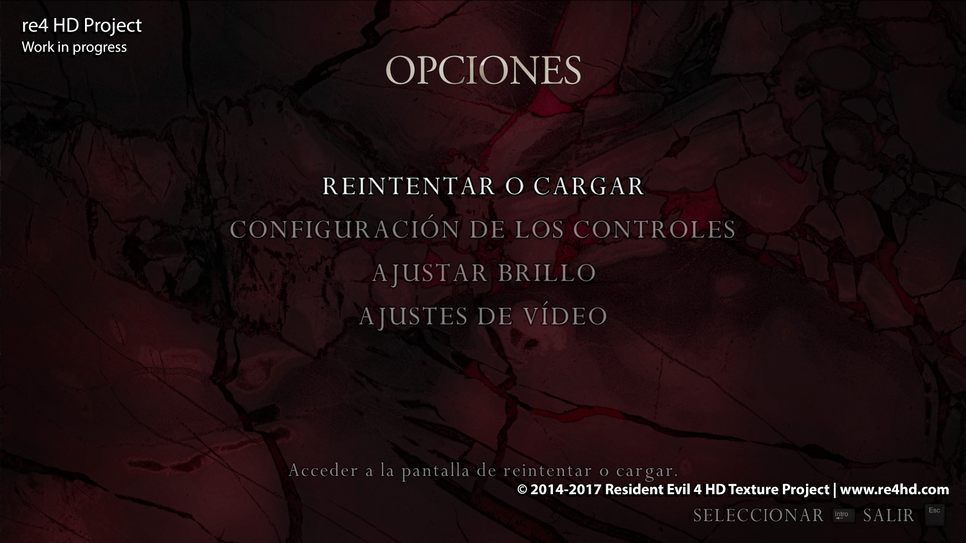
- OPTION SCREEN: I was lucky enough to find the original texture used for the OPTION screen. It was in a texture library (used by Capcom) that a colleague shared with us. The “HD Texture” option in this PC port simply used a random marble texture that was too saturated and not faithful to the original, as you can see in the first images in the gallery at the end of this post.
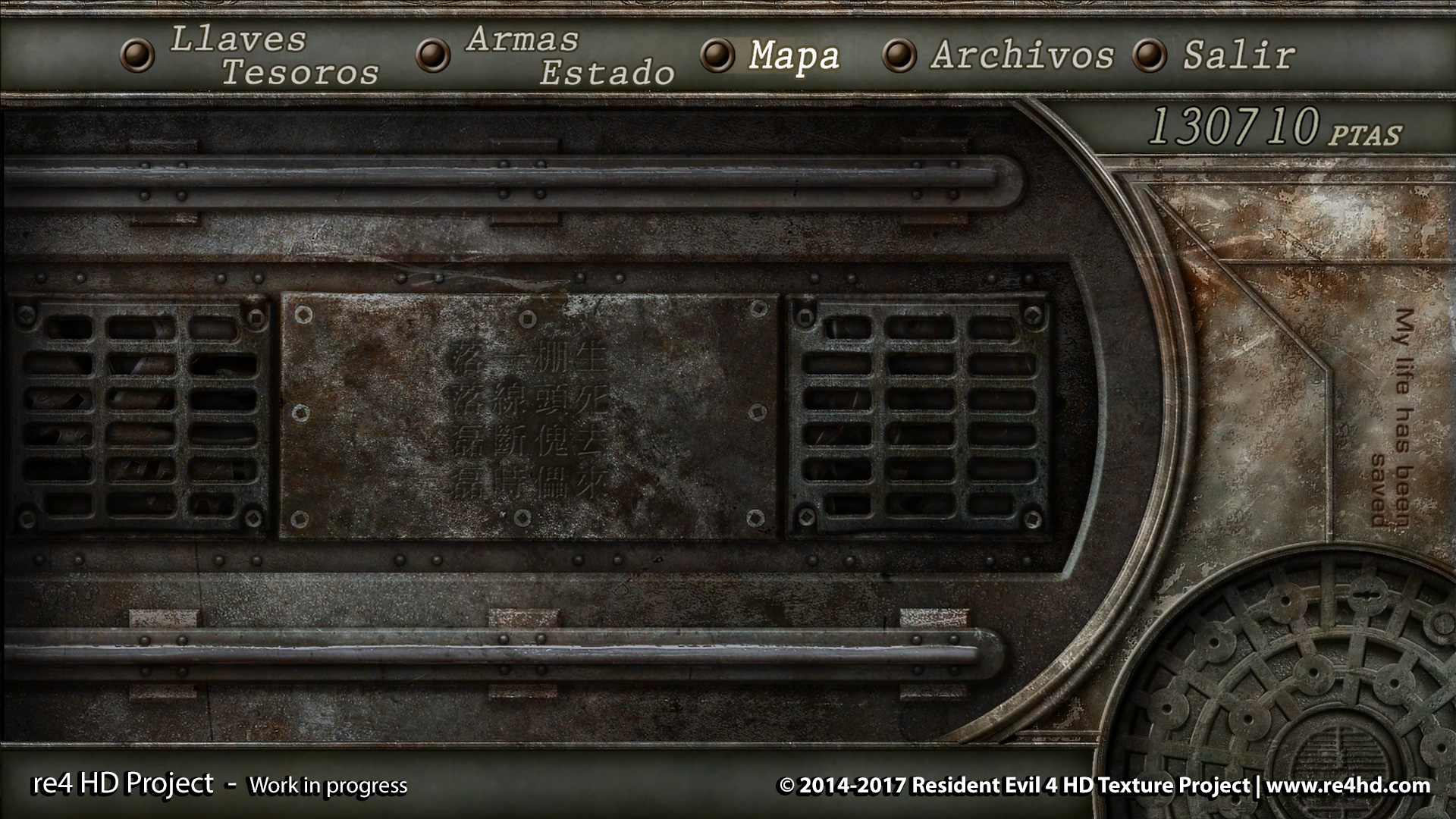
- INVENTORY BACKGROUND IMAGES: These textures were quite decently remastered, but they were not at a high enough resolution. So, I used the original Gamecube textures as reference for our own remastered versions of these textures. Again, I found some of the original textures Capcom used back in the day, and I restored the “My life has been saved” inscription from the original. I asked a friend of mine who knows Japanese about the Kanji you can see in the original Gamecube texture, but he wasn’t able to decipher that blurry mess… EDIT: Someone found the text! So, I updated the gallery picture 🙂
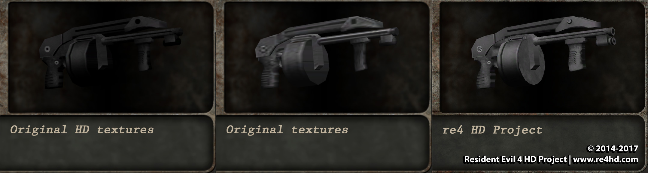
- WEAPONS and other item MODELS: The models used for all post-Gamecube versions have less polygons than the original Gamecube version. It seems they kept (perhaps by accident?) the low-poly versions from the PS2 port of the game. I restored and even improved all of these models. There is a limitation with these models that crashes the game if the file size of certain files are larger than the original, but I found that there is some dispensable data that can be removed from the .bin files (the 3D models), and even entire .bin files that are unused in-game. And thanks to Son of Persia and his programming skills, we were able to generate beautiful and better 3D models at lower file sizes. Otherwise, these sub-screen model improvements would be impossible!
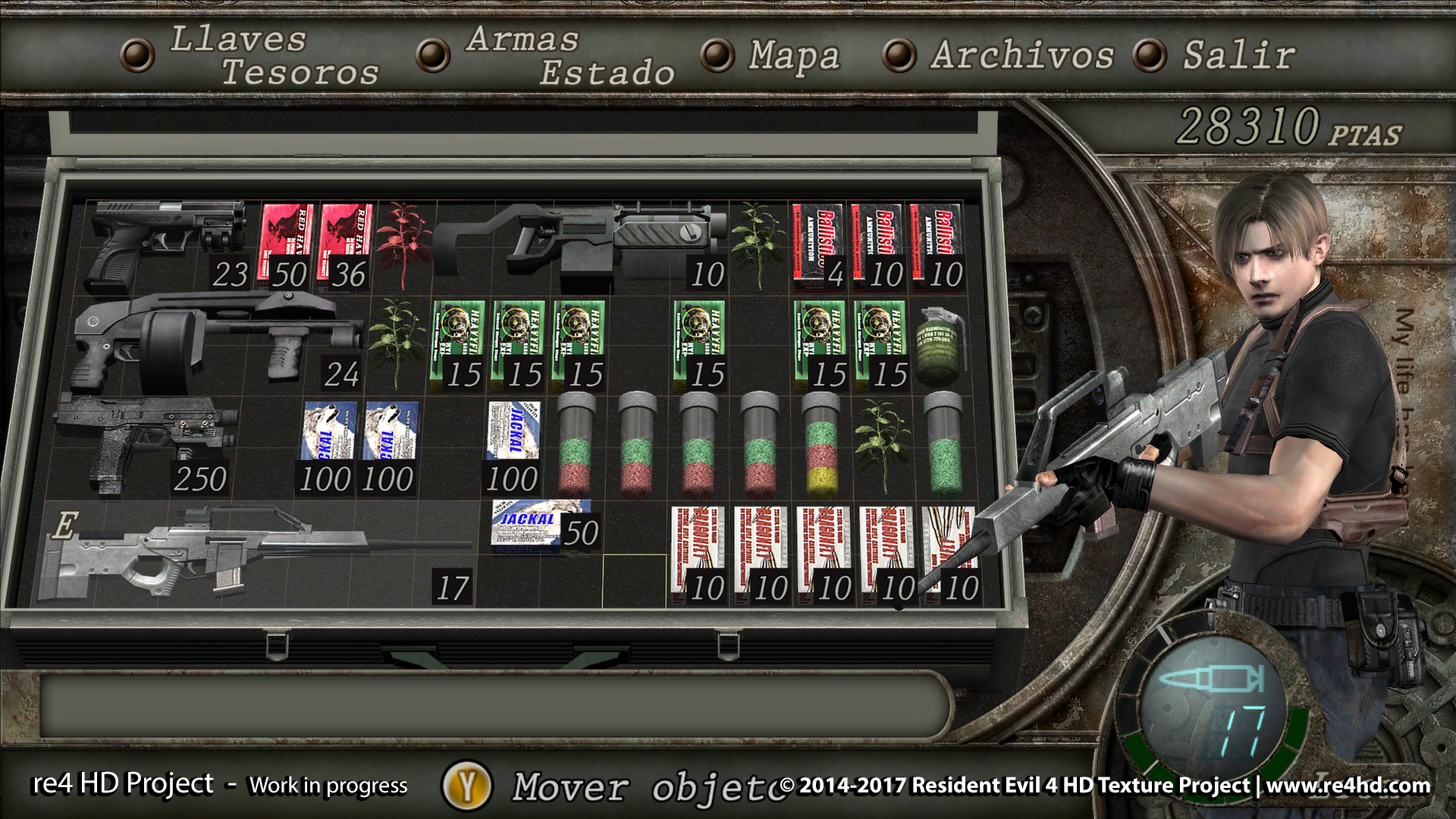
- WEAPONS and other items TEXTURES: The UHD team remastered the sub-screen items and weapons using higher resolution versions of the same textures you can find in other contexts of the game. But they didn’t notice that the textures needed to be lightened… because the sub-screen and Merchant shop backgrounds are quite dark…
- BOTTLE CAPS, FILE ORGANIZER, MAP, MERCHANT STORE… Everything has been remastered but I’m not sure if the bottle cap icons need a remaster. They look quite decent. I only restored one of the Ganado’s wooden shields and the background, of course.
Ok! And that’s all for now!
[ngg_images source=”galleries” container_ids=”151″ sortorder=”1679,1680,1681,1682,1683,1732,1685,1686,1687,1688,1689,1690,1691,1692,1693,1694,1695,1696,1697,1735,1699,1700,1738,1702,1703,1704,1734,1740,1707,1708,1709,1710,1711,1712,1713,1714,1715,1716,1717,1718,1719,1720,1721,1722,1723,1724,1725,1726″ display_type=”photocrati-nextgen_basic_thumbnails” override_thumbnail_settings=”0″ thumbnail_width=”120″ thumbnail_height=”90″ thumbnail_crop=”1″ images_per_page=”50″ number_of_columns=”0″ ajax_pagination=”0″ show_all_in_lightbox=”0″ use_imagebrowser_effect=”0″ show_slideshow_link=”1″ slideshow_link_text=”[Show slideshow]” template=”/home/content/p3pewpnas04pod08_data05/91/2963091/html/wp-content/plugins/nextgen-gallery/products/photocrati_nextgen/modules/ngglegacy/view/gallery.php” order_by=”sortorder” order_direction=”ASC” returns=”included” maximum_entity_count=”500″]Next week: Separate ways chapter 4. Don’t miss it! There will be are a few nice surprises. 🙂
I love it. I never noticed about five things before that in comparing these screens I finally did, my favourite being that I now realise the Merchant menu appears to be a close-up of his coat or something.
For the bottlecaps, could you not simply use your updated character models and textures later once those are done? I would expect there to be more of a limitation on these but you could use Decimate or whatever your software’s equivalent command would be, and similarly keep your updated textures, even if they need to be downsized.
Not that I’m saying it’s needed. The screenshots are hard to use as a guide in this case, or at least, my perception personally is skewed as a result of being used to these as larger models and therefore having trouble discerning the size correctly here. I can tell the shield is really nice, though.
Thank you for the feedback!
Those bottle caps preview images in the comparison shots are just 2D textures. They are not 3D models.
There’s no problem on updating the 3D models and their textures when you examine every bottle cap 🙂
I’d say the models are good enough and I don’t think there’s any kind of texture size limitation. So, we’ll use our future characters’ re-created textures for the bottle caps aswell.
My doubt was more focussed on the need of re-render these 2D preview images or not. Since I’m always playing at 1080 I’m not sure how blurry they look at higher resolutions. We’ll probably re-render them at some point hehe
OOOoooooooohhh, now I get it, haha. I had no idea it was 2D. Looks fine to me, but maybe you can post the actual image at full size on here and see what people with 4K monitors think, haha. I’m still 1080p myself.
Impressive!!! When will you release this newer textures, as they are not related to maps?
Thanks!
We still don’t know about future releases. But we always announce any release before making it public.
For now, we are focussed on making progress 🙂
Okay, I’ll wait then 🙂 . We count on you, guys!
Great work once again! The weapon models are so much better now.
Albert, are you or Chris moving to Resetera for the project? I really loved the NeoGAF thread, but it seems that most people are moving to the new forum.
Oh really? I was not aware of that. Since Cris was the one who started the NeoGAF thread, I’ll leave the decission to him.
But thanks for the heads-up! I’ll take that into consideration. Maybe we can keep both and simply copy paste the progress posts in both forums XD
They’ve already got a RE4HD thread set up for you at Resetera. A lot of GAF users were pretty adamant about leaving the site after the Tyler news, so I imagine at least a few past users won’t be seeing your posts there anymore.
As for this update, it all looks great, and the UHD Edition HD textures really pale in comparison. I like that you fixed the body armor match its in-game appearance. I don’t know how I feel about the “my life has been saved” text… I never even knew it was there in the original. Not really sure what it’s supposed to mean… It almost strikes me as the kind of questionable English that the artists sneak in occasionally (great example from RE0: https://c2.staticflickr.com/2/1513/24463757926_3ac7f0db89_b.jpg )
I think the kanji writing is Chinese, since Japanese would have at least a few hiragana characters in between. I can recognize the one on the top right as 生 (health/life), the one beneath it as 死 (death), but the rest are pretty hopeless.
Yeah NeoGAF is going through… some hard times, so a lot of the community has ditched GAF and moved over to https://www.resetera.com/
Would love to see you guys over there!
I’ve mainly been going to ResetEra over the last few days and I’ve registered, but I’m waiting for the approval so I can begin posting updates. While in general I’ll be active on ResetEra primarily, I think we’ll still update the NeoGAF thread for folks getting updates there. On a side note, (from what I can see so far) the folks running ResetEra have done a great job in setting up an improved forum and handling the influx of new users — it’s remarkable!
>Next week: Separate ways chapter 4. Don’t miss it! There will be are a few nice surprises.
I hope you found a way to implement GameCube water from main campaign in that area 😉
Oh yes, that’s fixed, too ;-P
Se ven realmente bien esos cambios en los menús, simplemente no puedo dejar de ver los cambios simplemente hermosos, espero que te puedan ayudar con los kanjis del menú.
Te ayudaria pero ya estoy con los proyectos finales de la maestria así que no mucho tiempo libre.
te dejo un diccionario que puede ser de ayuda.
https://issuu.com/global-japan/docs/diccionario_de_kanjis_al_completo-espa_ol-f
Gracias!
Mi amigo que sabe japonés no ha podido averiguarlo porque son ilegibles. Su nivel es alto puesto que vive y trabaja en Japón. A mi me resultaría imposible descifrar de entre los miles de kanjis cual es cual.
Pero no es algo crítico puesto que tampoco tienen mucho sentido unos kanjis ahí en medio. Aunque sean “molones” de ver XD
Ya está!! (de derecha a izquierda)
生死 去 來 棚頭 傀儡 一線 斷 時 落落 磊磊
Es de aquí que no tengo ni idea de que es esto. Un fotograma de un anime creo…
https://mathisgasser.files.wordpress.com/2014/09/zeami-9.jpg
Estas son buenas noticias y por la estética si parece de anime, en serio estos pequeños detalles hacen que se vea realmente hermoso el juego, si de por si no dejo de jugarlo ahora menos.
Increíble todo el progreso que han realizado, se ven realmente geniales las texturas, pero debo preguntar ¿Por qué la broken butterfly se ve diferente? ¿Confundieron las imágenes?
De cualquier manera no puedo esperar a que terminen y pueda jugar. Saludos.
Gracias!
Eso se debe a una extraña diferencia de cómo se ve el arma en diferentes contextos. Cuando la encuentras dentro del cofre en la habitación del castillo y en el modo examinar, el detalle del mango en ambos casos es gris. En cambio cuando Leon la tiene en sus manos y en el inventario, es marrón… De momento he decidido conservar el diseño gris , ya que es el que se ve durante el modo examinar con las texturas más detalladas. No hay manera de saber qué diseño hubieran elegido los creadores como definitivo si se hubieran dado cuenta del error.
En mi opinión, creo que el café se ve mucho mejor, pero lo que uds. decidan me parece bien.
Otro detalle que noté en la Broken Butterfly es la falta de las “cuencas” (no sé el nombre correcto) que hay en el cilindo de las balas en prácticamente todos los revolveres. Creo que la harían ver mucho mejor ya que luce demasiado pulido.
No sé si ya vieron esta imagen hecha por otro fan (tomada de las pistolas reales en las que Capcom se basó), pero me parece que se ve muy bien:
http://residentevil.wikia.com/wiki/Talk:Broken_Butterfly
Mira que tal está ahora la broken butterfly 😉
https://www.re4hd.com/wp-content/gallery2/0137-inventory/INV_15.jpg
(Pulsa F5 o refresca el navegador si aun ves lo mismo)
¡Excelente! se ve realmente bien, gran trabajo, como siempre. Solo creo que la parte plástica del mango debería cubrir casi todo el metal ¿cierto? veo que sobresale mucho metal en ambos lados, supongo que no es demasiado complicado de corregir.
Si. Tienes razón. Me resultaba complicado poder arreglar esto (por motivos geométricos muy difíciles de explicar sin un video XD), pero finalmente he logrado hacerlo 🙂
https://www.re4hd.com/wp-content/gallery2/0137-inventory/INV_15b.jpg
Gracias por los comentarios! Seguramente lo hubiera dado por bueno sin tu empujoncito y ahora queda mucho mejor 🙂
Que tal Albert, impresionante el trabajo, realmente es para los que jugamos el juego hace años de años…un juego diferente, nuevo…
Te iba a decir una opinión, el lanzagranadas mejora pero siento que aun mantiene un tanto un tipo de estilo muy…”plástico”…crees que sea posible ponerle algo mas de textura? hablo sobretodo de la parte que va e el codo de León y el cargador…no se, es solo una opinion 🙂
“Next week: Separate ways chapter 4. Don’t miss it! There will be are a few nice surprises. ?”
One of the things I like most on this game its the real time cutscenes on the leon campaing, they are so good to see on 1080p, but on ada campaing we only have pre-rendered movies stuck on 480p, as Capcom did the separate ways as a dlc for the ps2 release, and the ps2 didn’t get the realtime cutscenes even on leon campaing due to the weakness of the ps2 I think, then port after port Capcom never did realtime cutscenes for the separate ways, then my question is.. can you guys do something about this?
Hopefully that’s the surprise, but I wouldn’t count much on it, as they’ve previously said that all their tries had ended in failure, as the game crashes or scales the video to a small frame or something along that line.
I’m sorry but no… that’s impossible right now. Only Capcom can re-render those videos at higher resolutions…
Besides there’s that technical limitation you are mentioning that doesn’t allow to replace the videos with higher resolution ones because it always will zoom in to the central 512×336 pixels.
Once again, great work guys
Have you tried checking the font packs used in the PSX-era RE games? The ones used in the inventory menu looks awfully similar to them, including the outline around the characters and the pixelated look common in that era. It might be worth checking out. Here’s the one used in RE2: https://www.spriters-resource.com/download/6759/
Also, any chance you could share the name of the texture pack used by Capcom. Is it the sozaijiten texture packs?
Hehe, they used lots of different textures libraries and yes, this is one of them 😉
They even used some personal blogs pictures and pictures from e-shopping sites… and, of course, they used their own pictures they took during their travel to Europe.
About the fonts. These fonts look really pixelated, so I’m afraid there’s nothing we can do with them.
Woops, I meant the obscure-looking kanji used in the menu. They look like they were pulled from the kanji/kana sprite pack used in the PSX-era Bio games.
Any chance you could share the names of some of the other commercial texture libraries they used? I’m trying to find some of the textures they used for the pre-rendered BGS in the older RE games. Things like the wallpapers and carpet textures. Any help would be appreciated. 🙂
“They even used some personal blogs pictures and pictures from e-shopping sites…”
“personal blogs pictures”
Wait, seriously?!
Yep. I have no idea if they asked permission or not… ahem… But that’s their problem. For example, a site of abandoned factories pictures and a site that sell second-hand medical devices are good examples.
Some of those pictures are still too low-res So we re-created some of them anyway even if we found the original. But it’s easier to remaster something when you have a more clear version instead of a blurry bunch of pixels 🙂
That’s very cool man. When it will be released? Any idea? And it can be downloaded separeted from the castle release and village release right?
PHENOMENAL WORK!!
Weapon models are very bad. Original ones are horrible. There are a lot of weapon mods with beautifull models and textures. I think, in this case, you don’t need to do the same as original models and make your own.
I realy like your mod. It is the best I saw ever! But in original game the weapon models – is the worst part of the game. Design is realy ogly. You need change it, not fix. Make models from real weapon, please.
Like that:
http://1.bp.blogspot.com/-SmWI8L7BNUQ/TjCKRV3iiII/AAAAAAAAAH4/_H17e3hCvtY/s1600/Beretta+92.jpg
Hello!
I understand what you mean but we can’t change any designs of the game. This is a remsater project, not a mod. And edit things using random judgement is out of the scope of this project.
Then we have the polygonal limitation. The weapon models in Merchant store and Inventory can’t look any better. Otherwise the game will crash.
But they will look much better ingame! because there’s no that polygonal limitation 🙂
Super nitpicky here, but the original texture for the first aid spray says “LIFE SAVE” while your version says “LIFE SAFE”. Is there a reason for the change, or is it just a typo?
It’s a typo but I’m not sure which one is the grammatically correct…
Seems to be more of a “generic brand name” than an actual word like a lot of nonsensical product names out there.
Thank you!
I’ve check it and the original Gamecube word used is “Safe”.
“Save” is only in the remastered texture created for the UHD version of the game 🙂
SAVE = past tense, to store something (or in this case, Restore health)
SAFE = present tense, to keep something secure (Banks have Safes)
In this sense, I would go with SAVE because it is like the candy Life Saver, and SaFe makes me think of something you lock valuables in
So maybe the UHD team change it on purpose because they thought it was a typo of the original texture. An “Engrish/Janglish” case maybe?
If the gamecube was Safe Id say stick with that 🙂
Amazing update! here are some of my comments:
-I think the arrow quiver texture looks oversharpened, too grainy, maybe something more “leathery” will look better?
-In the merchant screen, the “made in china” are in caps while the original’s aren’t, also the light on the left side of the belt (the part where it “clicks”) is coming from a different side than the original (and from the rest of the scene)
-The shotgun (the basic one) looks kinda weird, specially in the “reload handle”
-The First Aid Spray text says on the UHD “live save” on yours says “life safe”
-The mixed herbs look awesome, that transparent glass is the way it should’ve always looked. Just make the cap a little bit darker (like the original texture)
-In the original pocket watch, the numbers and hands are gray. Also the perspective (of the numbers and hands) is a little off, it looks too “frontal” when compared to the rest of the body
I know some are just nitpicks and maybe some are not worth reworking (like the font in caps), but I guess it’s worth mentioning and have you guys decide what’s best for the project.
Thank you for the feedback!
-Arrow quiver: In fact… it’s already a leather texture XD. But the problem is it looks grainy at the distance because the leather pattern is small. It looks much better at close range “examine view”. I’m taking note of this! I agree it looks grain texture and not leather at this size…
-Agree again. I must admit that “click-piece” was a rushed job. I don’t like the lighting differences either but we’ll fix it!
-Shotgun: Mmmm… I’m not sure. I’m not a weapon expert XD The texture will be improved, that’s for sure! There’s a great database about which real life weapons the game weapons are based on. But any other picture reference will be welcomed.
-Spray: Which one is the grammatically correct? I’m sure there’s a few “Engrish” texts here and there hehe
-Mixed herbs cap: Agree!
-Pocket watch: Wow! Eagle eyes! hehe I didn’t mention it but all items have been re-rendered using the examine view models. It was quite a pain to get almost the exact position and lighting the originals have but it can be improved by just moving a little bit more the camera and click “render” again. I don’t know where that reddish tint the numbers have came from… but it’s easy to fix! 🙂
Thank you again for the list! I think most (if not all) of them will be fixed
Awesome, glad I can help a little 🙂
About the text on the f-aid spray, I’m not sure, as spanish is also my first language =P but, after doing a little research I found that there are companies named “life save” and others “life safe” so, probably both are “correct”. Maybe is better to stick to the original, unless a native english speaker has some input on it.
Just to be clear about the pocket watch, I don’t mean the perspective of the full object (although I noticed that, specially in the chain, but I think it’s not relevant at all). I meant that the white “sticker” seems to be “looking” more frontally to the camera than the rest of the watch, as if the body was in a 3/4 perspective but numbers and hands were being seen from the front (not as pronounced, but you get the idea). And now that you mention that is a re-rendered 3D object, could it be that the texture is not placed correctly?
Again, thank you for all your hard work, is really awesome.
The Inventory screens showing all the different items (Grenades, First Aid Sprays, etc.) have a really blurred, unclear background, namely the black part. I think something should be done abou that, but other than that, really impressive work. A shame those kanji couldn’t be deciphered, although I think most of them could be compared to clear examples of similar ones and eventually, you could find out what they are.
It was already decyphered 🙂
生死 去 來 棚頭 傀儡 一線 斷 時 落落 磊磊
About the blurred background, the original texture is completely blurred. What I mean is it’s not blurred because it’s a low resolution texture. It’s blurred because they applied some kind of gaussian blur filter so the item stands out. But we can add a subtle layer of detail over that similar to the work I’ve done to the lower part of the picture (the area with text). I guess that would be the best solution.
Thanks!
Perhaps that would be best. It’s just that it looks really odd and out of place among all the HD stuff, as if it wasn’t touched at all.
Also, just out of curiosity: What does it actually mean?
Live dead
Shelf puppet
A single line
Falling edge
Google translator. It’s sounds quite creepy XD
Hmmm… I wouldn’t trust Google translator on that. I would ask someone who speaks Japanese even a little bit.
It’s a line from the Noh play “Kakyou” and was also used in Ghost in the Shell 2: Innocence, which came out shortly before RE4.
I found the following translation:
“A marionette on the shelf is nothing more than a marionette. It looks alive but it is not. Once its thread gets cut off, it falls onto the ground.” (https://detail.chiebukuro.yahoo.co.jp/qa/question_detail/q11164895581)
A friend of mine who lives in Japan told me it’s from a Buddhist book that is written in the form of a traditional Chinese poetry and that’s why the kanjis are grouped in blocks of 4.
(He also asked a Taiwanese friend of him)
And yes, he also told me that was the translation… more or less. So I guess it’s just a random text. But who knows if the re4 Team put that text in there as some kind of profound metaphor we can’t reach to understand XD
Leon is the marionette
The shelf is the inventory (or the entire game!)
It looks alive but it’s just a bunch of “0” and “1”
If we throw the controller pad out of the window (the threads), he will remain unmoving
The enemies will kill him and he will fall onto the ground.
Is this profound enough? 😛
I tried translate it myself. It should be more like this:
生死去來/life and death come and go
棚頭傀儡/marionettes on the stage
一線斷時/when the thread gets cut off
落落磊磊/all falling apart loud and clear
“棚頭” is a stage for perform in old days. “落” literally means going down but in “落落磊磊” it doesn’t mean exactly the same way. “落落磊磊” represents the distinct and clear sound made by many small objects unceasingly hitting a hard surface. But I’m not saying “falls onto the ground” is wrong. I just feel not that right. Maybe the focus isn’t about falling.
I asked a friend of mine and this is how he understand the line: Buddhism say there is a loop. We all are trapped in it. We think we are free but we are not. We are born, we grow up, we get old, we die. And then we go to the second life and repeat all this shit again and again. (life and death come and go) Like marionettes being played in a show. (marionettes on the stage) The thread has many names, some call it fate, some call it gravity…. The only way to get free is to escape from the loop, that is cutting off the thread. (when the thread gets cut off) Only that way can we overcome life and death. Once you made it, everything will be all clear. You will be the world and the world will be you. You will exist the way like you never exist. You will vanish the way like you are always here. You are a single drop of water and you are the rain itself. (all falling apart loud and clear)
I have no idea if what he said is true, but I’m willing to believe it as it sounds much more inspiring than just hit the ground and crushed to pieces….
Thank you for the in depth analysis! What you friend understood sounds quite interesting. It looks like he really has some skills on poetry interpretation.
I also like the link between these lines and RE 3.5 theory 🙂
I don’t like how it says “My life has been saved” sideways on the inventory menu, I realize that was probably always there but it seems dumb lol
I wonder if that was originally intended to have religious context like, was he “saved by Jesus”? Just based on who Leon is and where he is, I think it would be more fitting if it said “My life has been turned upside down” lol and then maybe when you beat the game the text could change to say saved instead, would be interesting especially since you cant see it anytime Leons character stands in the way
I always understood those words in a “Phew… I’m in the Inventory Screen and nothing can kill me while I’m here” sense
Haha yes I know XD but it brings me good memories. It’s a homage to the original Gamecube version 🙂
it was visible back then?
Yes, thist screenshot
https://www.re4hd.com/wp-content/gallery2/0137-inventory/INV_01b-gc.jpg
Is from Dolphin while emulating the Gamecube version of the game
Lol I beat the game 30+ times, I vaguely remember possibly noticing that one time, but totally forgot about it
Hey, been keeping tabs on your work for a while now, but first time commenting. Just want to say you guys do an amazing job! I love your attention to detail and dedication to keeping designs consistent with the original creators’ intentions.
Having said that, I just want to point out my thoughts on the “My life has been saved” text. I literally never once noticed that in the original game so I had to double check myself to make sure it was really there and that I wasn’t going crazy lol.
I think the problem is that in the original, the text was much more faded and worn out and blended in with the background. Now that it’s in HD, it stands out and contrasts with the background way too much. If it were up to me, I’d remove it entirely because I think it’s super distracting. Fading it a bit more might help though. I’ll leave it to you, of course. I’m just concerned most people, having not noticed it before in the original, might see that and think it was some type of personal touch added by the modders.
Just my two cents anyway, take it or leave it. Keep up the great work!
Thank you for posting and for the feedback!
Yes, the text is too contrasted… Partially because we are comparing it with the original and lower resolution version. But I think I made it to stand out too much
I already have this pending touch up in my list. So, I agree!
But I’d like to keep the text, as I said, as a homage to the original and first version 🙂
I gotta say the menu items look great. Its awesome that you guys found the menu background, the vanilla hd texture always looked tacky to me xD
Hey guys, amazing work, as always, hat you two are doing is amazing!
I would like to ask if there’s any plans to touch up the in-game HUD a little, just to make it at a higher resolution.
Also, I would like to suggest one small thing: is it possible for you guys, when releasing the final package, also add some controller button mods? It would be really cool to have the Xbox 360, Xbox One and the PlayStation buttons, or at least for the Xbox One, as the 360 is the default used by the game and there are already PS buttons mods out there.
Once again, congratulations for the amazing work!!
Thanks!!
Yes, We’ll remasrted the HUD too. Probably using as reference the original Gamecube one.
About the button mods, this is something out of the scope of this project right now. Did you take a look at http://residentevilmodding.boards.net ?
I’m not sure if there is something already available but at least you can ask there about this 🙂
There are currently no button mods for gamecube, there are button mods for ps2 but nobody has made one for gc, I think its because it can be difficult getting a gamecube controller to work properly with the game which is a real shame
I think everything looks great 10 out of 10.
Small critique:
1. https://www.re4hd.com/wp-content/gallery2/0137-inventory/INV_07c.jpg The font is a little too fat, and doesn’t fit properly in the spaces, maybe make it a bit thinner/use a better font?
2. https://www.re4hd.com/wp-content/gallery2/0137-inventory/INV_10.jpg maybe put a slight grey filter over the map; it’s a bit too bright.
3. https://www.re4hd.com/wp-content/gallery2/0137-inventory/INV_12.jpg a slight black/dimming filter on the handle– it’s a bit too shiny.
4. https://www.re4hd.com/wp-content/gallery2/0137-inventory/INV_18.jpg should the barrel be more metallic/shiny and less ceramic? I only bring this up, because maybe you guys know what all the guns should look like, based on their real-life counterpart.
5. https://www.re4hd.com/wp-content/gallery2/0137-inventory/INV_19.jpg This one just looks really low res, the front handle is very N64. https://www.re4hd.com/wp-content/gallery2/0137-inventory/INV_23.jpg This one kinda does too. I think it might be missing a lens under the barrel’s opening.
6. https://www.re4hd.com/wp-content/gallery2/0137-inventory/INV_01d.jpg https://www.re4hd.com/wp-content/gallery2/0137-inventory/INV_01b-gc.jpg the button should light up yellow when selected. and maybe make the buttons’ rings have a bit more texture? I think that’s what the designers were going for.
7. https://www.re4hd.com/wp-content/gallery2/0137-inventory/INV_27.jpg https://www.re4hd.com/wp-content/gallery2/0137-inventory/INV_02c.jpg The herbs should have a bit (just a touch) of a yellowish/warmer hue, right now they have a cold, whitish hue, like ceramic. Here’s what I mean http://media.mercola.com/assets/images/foodfacts/basil-nutrition-facts.jpg https://maxpull-tlu7l6lqiu.stackpathdns.com/wp-content/uploads/2017/04/bush-basil-400×600.jpg https://us.123rf.com/450wm/anko/anko1208/anko120800064/14979553-red-autumn-virginia-creeper-leaf-on-white-background-close-up-view.jpg https://static.pexels.com/photos/64755/red-oak-oak-leaves-autumn-leaves-64755.jpeg
Lol @ how huge and inflating the links are.
But yeah, that’s all I’ll post for now, again, everything looks great. Just a few tweaks to consider.
Hello again! and thanks for the list!
3-4-5-7 We still need to re-create/touch-up most of the weapon/item textures for the examine view/ingame context. So, we’ll reuse the resulting textures in the inventory context, too and they will look much better that now 🙂
1. Now that you mention it… The re-creation is slightly bolder, yes. About changing the font… I don’t think that’s a good idea because there would be complaints for sure. We’ll stick to the original font to avoid font choices discussions.
But they will look better in English. It’s easier to fit “BUY” “SELL” “TUNE UP” inside those rectangular holes and I’m sure they were designed to fit properly Japanese and English texts. But there’s always a way of making things to look better 😉
I’ve updated the screenshot!
2. Agree! (screenshot updated, too)
6. That yellow button is constantly fading in/out. I probably took the screenshot at the precise moment it was at its lowest intensity. About the rings. The original texture looks quite clean and smooth to my eyes. But I guess some degree of subtle metal/rust detail won’t look bad at all ;-P
Which versions of RE4 are visually best and which is worst.. Gamecube, PS2, Wii, X360, PS3, etc?
PS2 is by far the worst
PS4 version is the best for consoles, it has improved facial animations
Steam UHD version is better because it has mod support
Wii version played on Dolphin emulator with upscaling is also good
The game was originally intended for Gamecube, so I like using the gamecube controller the most, but an xbox controller is good too, and the Wii version is fun too
“PS4 version is the best for consoles, it has improved facial animations”
Really?? Could you post the link to some video showing that? I had no idea. I knew some villagers textures and Leon’s jacket were improved and that’s it. And none of the graphical issues were fixed (consequence of a bad porting process from Wii to PS3/X360 and then from X360 to PC)
Hmmm I guess I was wrong, I thought I read somewhere the ps4 version had improved facial animations but now I cant find any info on it… maybe it was just the improved villagers textures I was thinking of but I swore I saw a video showing improved faces sometime ago
I got a few VERY nitpicky comments on the gemstones.
First of, the gold encasing in ‘INV_31’ seems a bit low res and I actually think the original one has a bit more realistic colour, lighting and texture to it. It also has a more brass like look to it which might be what it is supposed to be.
The second is that the ruby itself seems to be too bright and has more of a ‘fantasy’-esque look to it, while real rubies are generally darker like this example I think:
https://www.gemsociety.org/wp-content/uploads/2015/12/3.03ct-Oval-Ruby-from-Winza.png
Third and final is the emerald ‘INV_29’, which like the ruby seems to be too ‘lit-up’ and has a strange colour to it. Maybe it should have a hue more like one of these:
https://www.gemsociety.org/wp-content/uploads/2017/07/em_clarity.jpg
The gem in ‘INV_33’ however seems perfect to me and doesn’t really need any change.
To be honest I don’t know why I even cared enough to notice and write about this, they’re some extremely minor things anyway, but if you can use the feedback then oh well.
Keep up the great work.
I agree, the gems look to bright and they dont even seem improved really
I just looked at the guns in detail for the first time, and I noticed the magnum now has a black handle instead of brown
Yep, we’ll re-render again them when we re-create some of the item textures (in the Merchant store and treasure inventory they are 2D images, not 3D models)
About the magnum, it’s black when you see the weapon inside the treasure chest and in the examine view, but brown in the inventory and ingame. 50%-50% I chose the black design but we can switch to the brown design at any time if it’s needed or we change our mind.
The black design looks good, but it seems to go against the idea to maintain the original look and feel, the brown handle makes the gun look older
But the black design is also the original. As I said, it appears when you find the weapon in room 20a and in the examine view. It was inconsistent and there’s no way of knowing which one is the Capcom’s final desing for that weapon and which one is an unfinished texture they forgot to change. So, I had to chose: black or brown.
We can switch to brown but we’ll need to change it from black to brown in these two contexts I mentioned to make all 4 of them coherent (ingame, inventory, item inside the chest and examine view).
Thanks for the comments and the image references! They will be useful 🙂
All the images in the Merchant store and the Treasures inventory are 2D renders of the 3D examine models. The Render process somewhat fails with transparencies and it needs to be touched up with Photoshop in order to get more decent results. But since we’ll update most of the item textures in future revisions, we’ll probably re-render these 2D images again using the new textures and they will look better! And we’ll use that opportunity to generate also better lighting. for certain objects
The Stairs in the Original looks thinner and have stronger and better shadows
In the HD Project They are so thick and looks flat because of the soft shadows
They also have better Highlights on the edges (in the Original)
Everything else looks Stunning, Can’t wait for the next Update 😛
https://www.re4hd.com/wp-content/gallery2/0137-inventory/INV_35a.jpg
https://www.re4hd.com/wp-content/gallery2/0137-inventory/INV_35c.jpg
Real life Example, But here they are so strong because of the sun
http://everystockphoto.s3.amazonaws.com/scfiasco_stairs_shadows_415918_o.jpg
I think the stairs look nice, but they seem bigger and are too close to the figures now. In the original (35a) the steps appear to be about half an inch farther back, and in the new image (35c) the steps are so close to the figures that some of them look like the stairs almost are clipping through their bases slightly. Look closely at the bottle caps on the far left (the merchant and the ganado with the axe) their bases as sooo close to the steps, same goes for the robed castle ganados (the one with scythe and other with shield)
It almost seems like the angle of the steps has changed, like you moved the camera down slightly and closer in, which causes the blue bases of the figures to not quite line up with the perspective, however this is only noticed when comparing the 2 shots very closely.
By the way, the background looks great! but the houses and fence almost seem to be farther away slightly, lol idk its not a major complaint just interesting
Hehe it was quite difficult to get the same exact perpective angle for the background image. But I guess you can’t notice that unless you compare them side by side (as we always do here XD)
About the bottle caps base. I agree! As I mentioned, we’ll improve it and make the steps height and shadows closer to the original!
Thanks again!
Thank you!!
And yes, I agree. it’s something I want to improve at some point 🙂
Estoy seguro de que más de uno me va a crucificar… pero me gusta más la paleta de colores del UHD, sin embargo estoy bastante impresionado (como siempre) con la calidad y fidelidad de las nuevas texturas, mi más sincero ánimo, un trabajo magnífico
Jaja tranquilo XD
Si concretas un poco estaremos encantados de echarle un vistazo!
A qué te refieres exactamente con la paleta de colores? hay alguna imagen en particular? Todas?
Puede que algún cambio tenga alguna explicación, que hayamos cometido algún error sin darnos cuenta o que, sencillamente, aun no está terminado y pensamos mejorarlo en la próxima revisión.
Gracias!
Es solamente en los ítems y en las espinelas, el resto me parece un trabajo fabuloso, con los colores más grises y alejado del tono oscuro de las armas del UHD me siento bastante a gusto, es una acierto a mi parecer los grises que utilizaron, pero de alguna manera, las cajas de munición no me convencen, me gustaban algo más oscuras, obviamente el tono desgastado que se deja ver en las cajas de las texturas del Proyecto es de lo mejor y bastante fiel al original.
Con las espinelas, me parecen medio raras la verdad, no niego que sea un trabajo genial, pero como que se ven algo extrañas
Gracias!
Si, las joyas es algo un tanto delicado de retocar. Con los modelos 3D no hay problema. Solo hay que retocar la textura y ya está.
En el caso de joyas y tesoros en la tienda del buhonero, no son 3D, son fotos 2D, renders usando el modelo de “examinar” del objeto. Y de ahí que sea más complicado conseguir el tono exacto de la foto original. Pero como tenemos que arreglar las texturas de los objetos, seguramente volvamos a generar los renders de algunas o muchas de estas joyas de nuevo y aprovecharemos para intentar ser más fieles a la imagen original, que en algunos casos (como la esmeralda verde) es bastante diferente. Y ajustar luces y contrastes de otros objetos.
En el caso de las armas y munición lo hemos mantenido como en las texturas originales (las de calidad SD, que son las originales de Gamecube) porque el equipo que hizo las texturas HD para el UHD no se fijaron que TODAS las texturas del inventario son más claras que las que aparecen durante el juego o al examinar el objeto. El motivo es sencillo: El fondo del inventario y de la tienda del buhonero son oscuras y según que arma no resalta. Pero no cayeron en este detalle y solo hicieron un “copy-paste” de las texturas de mayor calidad que tenían hechas pero sin ajustar el brillo/contraste. El ejemplo más claro, la striker que hay en medio de este post.
Un saludo! 🙂
<3 x100000
I love the new hi-res backgrounds especially the inventory one! ??
Something about texts! I think the stroke around them are too thin and should be more thick, just like the originals on Wii. Please see this short video: https://youtu.be/C3C1nWAi3oo ?
And the background for bottle caps also should be blurry… So the characters look more focused!?
Hi!
This is something I was thinking about too: How thick that outline should look?
I made it thinner intuitively. That stroke thickness looked nice when the game played at SD resolutions with low-res textures (the stroke needed to be that thick because of that) but it looks too much from my point of view at HD resolutions. The font looks now crisp and clear and this makes it to stand out more. In fact, I’d say it’s easier to see the text now even it has thinner stroke.
Any other thoughts about this?
About the bottle cap. I agree, it should be more blurry! 🙂
Thank you!!
Albert when is the next blog post? On the last post you said in a week but a weeks gone. No worries or anything, just love seeing new posts from you guys.
Coming within the next day or so.
Sorry for my late reply! ?
See this animated GIF from the link down below: ▼ 🙂
In this case as you can see in the GIF…
The image size is: 688×152, and 72 pixel/inch.
Font: Prestige Elite Std Bold. Font size: 164(font itself), 173(space between).
AA: Strong. Font color: #cec6c6. Stroke size: 12 px. Stroke color: #332b09.
Stroke position: Outside.
Inner Shadow: Opacity: 80%. Distance: 0 px. Choke: 100%. Size: 1px.
Drop Shadow: Opacity: 94%. Distance: 0 px. Spread: 52%. Size: 22px.
GIF: https://images2.imgbox.com/9f/cf/eV7eCMiq_o.gif
Thanks for all the details! This is (more or less) how I’m doing the new texts, but using thinner values of course
Thank you! ♥
I forgot to say that I enabled the “Faux Italic” style! But I think it was obvious… 😀
Here is a screenshot from the Character Properties in Photoshop sub-window: https://images2.imgbox.com/44/00/lIgFEP30_o.png
Thanks again! ♥
Thanks again to you! 😀
I was just comparing your weapon models to some I found here:
http://residentevilmodding.boards.net/thread/7025/ultimate-hd-weapon-pack
Now some of your weapons look better, but I like some in the older pack too 🙁
Oh, we still need to redo most of the weapon textures 🙂
About the inventory 3D models (in case you were compaing with them) can’t be any better because of polygon limitations the inventory context has in this game.
Fortunately, that limitation is no that strict in ingame context!
actually I think part of the problem is that Negaarmax’s images are a bit bigger and zoomed in so they look more detailed
To be more specific, I think your handguns look very similar to his, except your version of the Red9 is better (negaarmax’s Red9 is really dark)
But your riotgun and striker dont seem quite as nice, though it could be due to the size of your images. I also really like the handle of Negaarmax’s Butterfly, but I like your barrel better lol
I also read in Negaarmax’s thread that he did not increase the 3D models? I’m not sure if that matters, but I was surprised to see how good his looked, and now I’m thinking its just mainly due to the size of the images
Excelentes mejoras, incluso noto cosas que antes no me había dado cuenta como en el cinturón del mercante que dice “Made in China” o las inscripcion de “My life has been saved” a pesar de estar jugando este juego durante años, solo he notado una pequeña inconsistencia en el menú de tesoros, en la parte que dice “Objetos Clave” la palabra clave aparece sin mayúscula en la c.
Hola! Grcaias por los comentarios!
Pues tendré que revisarlo.
Pero quizá lo hice a propósito, depende de si en otras frases/textos, las palabras que no sean la primera también están en mayúscula o no. En mi opinión no deberían estarlo, ya que es un “anglicismo tipográfico” esa manía de poner mayúsculas a todas las palabras, y eso en castellano no se hace, salvo licencias gráficas en portadas, títulos, posters, etc…
Pero por supuesto es algo que debería unificarse en todos los textos del juego sea cual sea la decisión final y así lo haremos 🙂
How do you download the mod?
Hi!
There are 2 demos available.
https://www.re4hd.com/?page_id=4732
The Village pack is quite outdated. The Castle pack is much better in terms of lighting/effects/3D adjustments.
I hope we can release a new big pack soon 🙂
Hi albert 🙂
I’m Leon S. Kennedy (a.k.a verdugo7) from the RE Modding Forum
I really appreciate everything you did here they’re all amazing, but if I may give one suggestion,
I think the shotgun inventory model could be better, i mean, the grip (the rear one, the one near the trigger) looks a lot thicker than the original (makes it looks impossible to hold 😀 )
What i’m trying to say is , let’s compare it to the riot gun. 🙂 you made it look more “believable” to be held by hands , and I like it.
My suggestion :
try to make the grip look more “curved” on the shotgun, like, like you did on the bolt action rifle 🙂
So it will look better, but this is just my opinion, you can take it or leave it, thank you once again guys, you are awesome!
Greetings!
Uh it’s so hard to explain, it’s like this albert
http://www.imfdb.org/images/thumb/d/d6/RE4shotgun.jpg/600px-RE4shotgun.jpg
Note the “c” shaped grip , and even the default sub screen shotgun has it “C” shaped too,
What i’m trying to say is make it look “curved” and a little “thinner”, i am sorry I am not good at explaining much lol 😀
Hi!
I see what you mean.
Capcom distorted some of the weapons shape on purpose in the inventory in order to make them fit the slots they take up. Let’s see what can we do about this one! 🙂
Whoa that’s great! 🙂
Thank you for taking my request as a consideration 😀
Good luck and i’m looking for your (you and cris, ofc :D) next updates, and stay awesome 😀
Excellent work I am impressed, I would like to know if you are working on the texture of the skin and in the modeling of the arms of leon to make it look much more real, it is a curiosity that it is a hard job but the day that comes out will be incredible, when lighting some object with a flashlight or light will have dynamic shadows? It would be more amazing if you added more details to the leons body of his hands, his hair, his clothes and it would also be incredible when you shoot the enemies and there is some mark of bullet impact on his skin. I know it is a recommendation but in conclusion your work is the best one I’ve seen for resident evil 4. thats games its my childhood and it would be an honor to play your hd project good work and good luck with future improvements. regards 🙂
ESTO ES UNA ULTIMATE HD Edition! Muchachos me saco la galera ante ustedes, fenomenal trabajo! Esperando la terminación del proyecto. Y, quisiera saber en cual release se encuentra esto que mejora la Texturas de las armas en el Sub-screen e inventario del maletín, no se si me explique bien. Nuevamente fenomenal trabajo! Saludos.
Gracias por dejarnos tu mensaje y los cumplidos! 🙂
Estas mejoras no están incluidas en ningún pack… aun!
Esperamos que muy pronto deje de ser así. ;^)