Separate Ways – Chapter 4 (Part 2)


Hello again!

And here comes the second update from Separate Ways – Chapter 4.

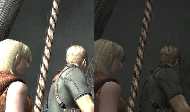
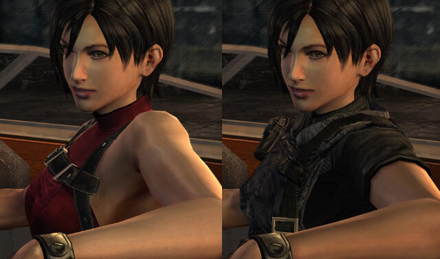
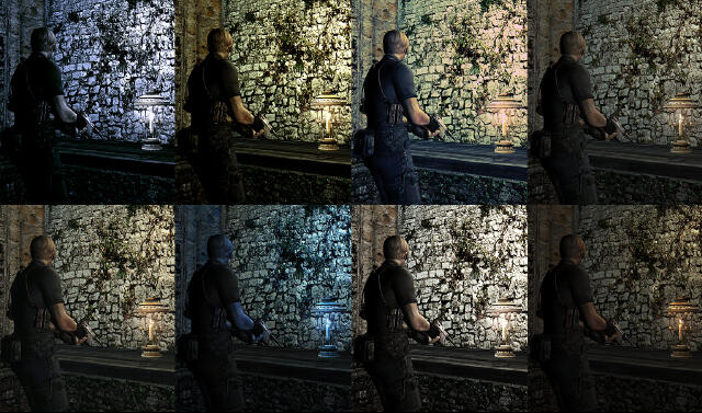
All comparison shots are from the first area, as the other 3 rooms are almost the same as what you saw in prior posts from Leon’s campaign (you can still see these areas in the video below).

What’s special in the first area? As you saw in last week’s update, this area now also has baked-in shadows, a lot of lighting adjustments, and 3D improvements. But for the first time I’ve done something really “big:” I created a new portion of a room from scratch!

Why would I do such a thing? Simple: Did you ever notice how the room transition from the destroyed road area to the room where Saddler kidnapped Ashley is somehow… forced? How is it possible that Ada climbs a ladder (apparently inside of a some kind of well-shaped structure), only to immediately break through a window and fall into a new room??

If you combine all the area maps, you’ll notice something is missing between the ladder and the broken window. I just filled in the gap between those two points.

You can see the result in images below and in the video: there is now a fully functional ladder that leads Ada to an upper level. The enemies will also follow you and you can descend and climb up again with no issues. All collision and gun laser limit data is adjusted to the new geometry, new light sources have been added, and all sizes and structures perfectly match the adjacent areas of the game.

I’m quite happy with the results because I’d say there’s no design / quality difference between the “official” part of the area and the new portion. The entire thing is pretty well-integrated.

Let me know what you think about this! 🙂 

Sorry Speedgamers! Your Separate Ways play-through will last 10 additional seconds. 😛


[ngg_images source=”galleries” container_ids=”153″ exclusions=”1768,1767,1781,1780,1779,1778,1777,1786,1785,1784,1783,1782″ sortorder=”1776,1775,1774,1773,1772,1771,1770,1769,1768,1767,1781,1780,1779,1778,1777,1786,1785,1784,1783,1782,1792,1791,1790,1789,1788,1787″ display_type=”photocrati-nextgen_basic_thumbnails” override_thumbnail_settings=”0″ thumbnail_width=”120″ thumbnail_height=”90″ thumbnail_crop=”1″ images_per_page=”20″ number_of_columns=”0″ ajax_pagination=”0″ show_all_in_lightbox=”0″ use_imagebrowser_effect=”0″ show_slideshow_link=”1″ slideshow_link_text=”[Show slideshow]” order_by=”sortorder” order_direction=”ASC” returns=”included” maximum_entity_count=”500″] 

This video includes the first attempt of the new Ada’s path:

2nd attempt:

3rd attempt:

And after a lot of revision this is what I’d say is the FINAL version of the new Ada’s path:


And finally, a detailed map that combines both Leon’s and Ada’s areas so you can understand easily the reason of the new path I created:

This entry was posted in Progress Updates and tagged , , , , . Bookmark the permalink.

160 responses to “Separate Ways – Chapter 4 (Part 2)”

  1. Leon says:

    This is so more sharper, and good looking. Except for the loss of bright colors in the first pics, i love the result. Keep on doing the best to give the whole game such a great and improved visuals ^^

    • albert says:

      Thanks!
      That colour difference is intentional. There was a super yellowish light source in the middle of… nowhere… comming from … who knows where ¿?¿?

  2. Cris Without H says:

    I think it would be nice to see a comparison between the old are and the are with the “missing” portion added. I don’t remember it well enough to say whether it was a good change or not.

    • albert says:

      That portion doesn’t exist in the original. You push the button to climb the ladder and it’s like entering a door. And all of a sudden you broke the window and fall onto the next room floor. So, there’s nothing to compare. It’s a brand new path created from scratch 🙂
      So, technically this is not a “change”.

      • Cris Without H says:

        I don’t think I understand. There has to be an overall area in which the ladder is. I mean, it has to be a room in the game. Unless you’ve created a whole new area.

      • Cris Without H says:

        Okay, after watching the video more carefully, I know see what you meant by the “missing” area. I think that the area below that catwalk looks too cluttered and that skylight looks incredibly out of place.
        Also, I think there should be some subtle hint to use that window.I mean, it’s not something present in the original, so how would anyone know to do that?

        • albert says:

          Hehe that skylight MUST be there. It’s impossible you reach the window Ada breaks without seeing it, unless I make a narrow and closed hallway instead of a catwalk, but I think the catwalk option is the most logical decision in order to keep certain level of homogeneity and the narrow hallway would be a cheap decission. (A hallway leading to a window has no sense)
          BTW, that skylight is the one in the room after Leon crashes the bulldozer.

          About the area under the catwalk being too cluttered. Well… not only I’m not seeing it cluttered but I’m seeing it even too empty XD
          I guess this is obviously a matter of taste and there’s nothing to compare. The entire level is full of boxes and stuff placed in a disorganised way and I tried to give that portion a similar vibe.

          Oh! and there is a hint, a really obvious hint 😛 Didn’t you see it?
          Anyway, I’m not in favour of making everything soooo easy. And I think it’s really simple to find out you can jump that window because you get a clear “JUMP” message when you are around it.

          If anyone have some other design options we’ll be happy to receive any well done draft with the pertinent explanations and reasoning 🙂

  3. Abz786 says:

    Keep up the great work guys! will there be an update next week aswell? plz say yes!

  4. Max says:

    wait, so you have to create another room using the in-game assets and have to program all of that

    • E.P.D. Gaffney. says:

      It’s not really much in the way of programming, but they do need to make an entire room and tell the game to use it. Basically, once the room is designed, it may need to be navmeshed for enemy AI to know how to traverse it, the end bit with the window needs to have the teleport data that the ladder used to have, and then everything needs to have the right collision.

      I think it’s a great addition.

      • albert says:

        Yep that’s a good overview of what I’ve done 🙂

        Thanks! I was afraid someone says “it’s not in the original and this is modding, not remastering” but that transition from that room to the next one always jarred me A LOT!
        I looked like an obvious case of developers having no idea of how to connect both areas…

        • E.P.D. Gaffney. says:

          `I’m a developer/modder myself, so I’ve done similar things. I’m only now getting ino scripting, and I love it, but people always used to think I’d coded stuff, when I was really just reüsing functionality that had already been provided, as a vehicle for my models and textures and story. I was always ashamed that I hadn’t actually coded any of it, despite having worked on sometimes just one room’s models for months on end. So, like any Catholic I decided to learn to code as penance. Might’ve been a couple of Hail Marys but I’m not a very good Catholic when it’s all said and done.

          So, if I’m supposed to know this I apologise and ask to have my memory refreshed: what tools do you use for stuff like this? Is there some room editor software or something that I don’t know about? Is it done the old-fashioned way, with naming conventions stored away in a text file?

    • albert says:

      No there’s no programming at all. It’s “simply” room files edits.
      The room files contains trigger areas data for open, jump, etc, some other files contain the sound played when opening a door (in this case I replaced the “climb ladder” sound to… nothing XD
      there are the collision files and the laser limits files (so, you can shoot through walls and floors) lights, effects, enemies routes, etc etc etc… it’s all by editing these files and the game reads the new data and it does its job just like any other room of the game 🙂

  5. HHH207 says:

    Thanks for your great work. I think, Ada’s shadow too dark like Ganados dark shadow problem, need a fix like Ganados shadows

  6. Andrew says:

    Hi, loving the work, been following your progress for around 16 months,
    and I’m eagerly awaiting this game’s well deserved passion project.
    Was wondering if you planned to update your Progress Summary once
    Separate Ways was all sorted out. Do you update it on a bi-monthly basis,
    once you’re done with a section, or you realize: shit I’ve been too focused
    and need to update it hah?

    • Cris says:

      I’d say *most* of the time it’s that last one. 🙂 Thanks for following the project and for the encouragement!! I’m sure an update to the Progress Page will come soon (especially since it’s been mentioned :)).

      • Andrew says:

        Knew it haha, can’t wait. I get excited seeing that chart amassing them check-marks. Think you mentioned somewhere of when you replied to someone about updating the playable release, and that it would be a lot of work and just not feasible with all the other things at hand. Pretty much slowing you down was the gist IIRC. Is there going to be a testing phase before a full final release when everything is pretty much set, or do you plan to just release it upon completion and fix it bug by bug basis if anyone finds and reports them?

  7. [ROLO] says:

    Awesome, the new area is excellent!

    Just a small thing that someone pointed out in a recent post: the tags on the boxes look too repetitive, just by rotating and flipping can look way better, just like on the original.
    https://www.re4hd.com/wp-content/gallery2/0139-sw4-ii/SW4-2-E.jpg

    Maybe you had this update ready together with chapter 4 pt1 and that’s why it’s still the same, but I thought I should point it out, just in case.

    • sean says:

      this is a good idea, it looks funny how the papers on the sides of each box are all identically lined up

    • albert says:

      You are right! I made these boxes from scratch and I didn’t notice the originals flipped/rotated the texture but now the texts are readable and some of them can’t be flipped, only rotated. But I guess that would be enough 🙂

  8. eric says:

    Very nice work !

  9. Pliskin says:

    I didn’t know you could create new rooms like that O_o Very impressive

    • albert says:

      Thank you! It’s reaaaaaaly hard to create a room from scratch with our current tools. It took me a few days just to make this small new portion. Fortunatelly there’s no need of adding any other extra “missing piece of room” hehe

  10. E.P.D. Gaffney. says:

    I’m thrilled to have yet another update. Everything looks great as usual. I love the new room, especially that skylight from the next room that you can see here. And I second the notion that we would enjoy an update to the progress summary, whenever there’s time to do so. You’re really getting close to finishing this thing, at least relatively. I don’t know how to put it into words but I am impressed, excited, grateful, and probably a bunch of other stuff. Can’t wait to play this again the way it deserves to be played.

  11. News Bo9t says:

    Can anything be done for Ada’s perpetual-grenade hand?

    • albert says:

      Do you mean when she throws the grenade and the hand’s still have the “I have something in my hand” shape?
      I’m afraid no XD
      But the hands can be remodeled I think. Now they look too blocky (Ada’s Separate Ways hands)

  12. Y.Z. says:

    Some suggestions regarding the new added section to bridge that awkward transitional gap:

    1. While it’s a good attempt, the way it is right now, both the new glass AND window frames don’t really match the actual, corresponding room’s (316 in Leon’s main scenario) own glass and window frames. You can already see the mismatch within the video provided, but here’s a better comparison of the ACTUAL 316 windows from an older video of yours: https://www.youtube.com/watch?v=b-lz4xpnVf4&t=1m53s

    2. If you notice, the room it’s supposed to transition to “316” has some slightly blue light emitting from the windows. Would it be possible to, perhaps, not only add gradual bluer colors/light sources to the new section (even the sky’s slightly blue in 316), but also add, say, a moon (which would make sense with how much window light there is in 316) to both the new section AND “316”? And a strong, semi-white light source to the new section as well? Or it this a similar case of the lighting configuration [potentially] getting in the way, as it did with the Village section: https://www.re4hd.com/?p=4833#comment-84352

    In any case, you’re really going above and beyond mere texture, 3D model/geometry & lighting face-lifts and bugfixes (missing effects in cutscenes, etc.) here, and it’s pretty damn impressive!

    • albert says:

      Thanks again for the feedback! And for the comments hehe

      1. The frames are copy pasted from the other room but I agree the window glass is different and it must use the same texture used in the other room!
      2. The main problem in this case is the light in this area has a completely opposed direction compared to the light in the next room. In other words: there shouldn’t be any kind of light enetering the windows in the Saddler-kidnaps-Ashley room. But changing the entire previous room light direction would be too much…
      Since there are several areas in the game whose lights directions don’t make sense between them and they change for no reason (other than aesthetical reasons) I think this is a lesser evil. Anyway I’ll see if I can do something about this in some other ways 😉

      Let’s see if someone has some better ideas to fill in the gap this “missing link” path 🙂

      • Y.Z. says:

        “The main problem in this case is the light in this area has a completely opposed direction compared to the light in the next room. In other words: there shouldn’t be any kind of light enetering the windows in the Saddler-kidnaps-Ashley room.”

        I do have an alternate idea in that case: How about adding lit floodlights (perhaps even the ones from Ada Room 513) to the new section? I think that would make some degree of sense then.

        • E.P.D. Gaffney. says:

          I think I do like the floodlights idea. The more I look at the new area, the less perfect it seems. I still really like it, but after the initial impression wears off, I realise that I do have some problems, one of which is indeed the lighting, which is of course because the two areas were never intended to be seen together. For that, I like the floodlights idea.

          Another problem I have is I would say it’s just slightly under-cluttered, and having the floodlights would aid in that as well. I’d prefer just more ‘stuff’ in the ground area below.

          My last major problem is the skylight. It looks out of place, and yet, I know that’s exactly where it should be. But there’s really no solution I can come up with. It’s really a problem of having this extremely nice couple of rooms lead into a factory in Leon’s main game, which in itself is kind of odd but we don’t care as much I think because of the doors that separate the areas. I don’t really have any advice, besides maybe drawing attention to the disparity, maybe dirtying up this side of the skylight or laying some debris and building materials near it.

          • albert says:

            I’m taking into consideration all your ideas guys! Thanks!
            I’m sure I can do something better with that new path with just a few adjustments. And I’ll try that skylight to look less out of place.
            About the floodlights … I’m not sure. The light comming from the windows looks like natural moonlight, and.. well… I’m not even sure if this is a problem… but I’ll think about this for sure! 🙂

      • E.P.D. Gaffney. says:

        That’s true about the moonlight. I think I still like the floodlights, but what it really comes down to is the new area is actually lacking a subtle bit of what I would call ‘character’ that the rest of the area has. Just little things, but they’re in literally every comparison shot. Unfortunately, the skylight would have contributed to that here, and it still does but it’s tempered by how out of place it is (which is completely not your fault; I have no idea what kind of building this is supposed to be besides a weird one).

        But I’m serious, there’s something in every shot:
        The first has that water-tower-looking thing, and stuff is falling apart, as if people worked here and had to put it back together over time, and the contrast with that black and yellow, and that light.

        Second places imposing rusted foundations and small red lights around you.

        Third has that barbed wire (and a floating sign? what?), a giant, long pipe that could lead anywhere (not in a focussed way, but it gives just the slightest sense of a backstory).

        Then there’s fire and lights and a demolished vehicle.

        And then the Biohazard sign and the lighting there.

        I think the new area is great, much as it may sound like a lot of complaining coming out of me. The truth is that though I stand by what I’m saying, it’s nitpicking. It’s such a short section and I’ll probably forget all about this once I’m playing.

        I like the pipe running along the building in the new section. I think if you cluttered it up a bit more down below, maybe added something bright in a couple of places out in the mid-to-back-ground by the other building (or is that the other side of this building?), and added just one particularly interesting thing somewhere that doesn’t seem out of place, the area would get that extra little push I would ideally want it to have.

        But in the end, I’m realising how uninmportant it truly is. Don’t drive yourself crazy trying to get all my suggestions in there or anything.

  13. Michael says:

    Amazing as always.

  14. NEGAARMAX says:

    *_* simplemente espectacular el cambio en especial con el área perdida, en serio te / se lucieron esta vez valió la pena separar en dos partes este capitulo.

  15. Catbus says:

    Do you think you might be going a bit too far with the removal/changes in light sources for rooms? Seems like you’re really messing with the artist’s intent, as opposed to your texture and 3D modeling work which is very faithful. Even if a light source doesn’t make some sort of physical/logical sense, they were placed intentionally, not mistakenly, no?

    • sean says:

      Separate Ways was not made by the original developers, lead designer Shinji Makami was not responsible for the addition of Separate Ways as it was left unfinished in the original gamecube release, and Makami left Capcom after disputing about the low quality changes made to the PS2 port of the game. Thats why lighting and many aspects of Separate Ways is so flawed, because the PS2 port was low res and the team that ported the game didnt care.

  16. Alireza says:

    hello and nice work.
    I really impressed about that ladder area !!!!!!!!!
    you know maybe there is something you can do about the chapter 2-1 after leon get the church key, he ride a boat in a cave which is just like this ladder and there is no clue about how he transport back to the El giante area…

    • albert says:

      Hummm I didn’t examine that room transition but I guess he simply drived the boat by that underground lake, isn’t it?

    • sean says:

      theres 2 boats in the village, the first boat is when you fight the fish monster, the second boat is just before el gigante. I never noticed any issues with the boats, leon finds the 2nd boat in the cave behind a waterfall which brings him back to the el gigante location. Nothing seems wrong there

      • Alireza says:

        you’re right there’s no issue. but the transportation with the 2nd boat is like opening a door like this ladder and there is even no route on the map (he just teleport in that cave)
        do you get what I mean?

  17. ItchyTasty says:

    In the new area, I noticed you put the fallen arrow sign pointing to the window here (clever), but I think the jump through the window still isn’t very intuitive. While the player will eventually figure it out, it makes you have to suspend a bit of disbelief and ask yourself, “Why would Ada jump through a perfectly good window when she could just grapple gun over to some other area?” Adding a small crack to the window is your best bet. Nice job on this area btw, it definitely makes the transition from the original two areas less jarring.

    • albert says:

      Aha! Good idea! 😀 A crack mark sounds really good.
      Thanks!

      “Why would Ada jump through a perfectly good window when she could just grapple gun over to some other area?”
      This kind of situations happen everytime any character is in front of a simple box or whatever and they can’t simly jump over the obstacle but they can jump from a roof to the floor without breaking a leg XD

  18. therealest says:

    I think everything looks spectacular. 10/10. Some of my critiques are the same ones from last time. The giant yellow door knobs and the repetitive boxes that have every side exactly the same. If you do fix the door knobs, maybe go for a darker bronze-yellow gold color; right now they look too yellow, and stand out a bit too much.

    Also #1: https://www.re4hd.com/wp-content/gallery2/0139-sw4-ii/SW4-2-E.jpg why did you add the extra plants there? Is that from the gamecube version? I think it matches, I was just wondering the inspiration.

    #2: https://www.re4hd.com/wp-content/gallery2/0139-sw4-ii/SW4-2-F.jpg and https://www.re4hd.com/wp-content/gallery2/0139-sw4-ii/SW4-2-H.jpg I think the step ladder looks gorgeous. Did you remodel the step spacing ratios after a real one?

    #3: https://www.re4hd.com/wp-content/gallery2/0139-sw4-ii/SW4-2-H.jpg I don’t know how easy or hard it would be, but just consider maybe honoring the original cemented tunnel look, rather than the square, adjacent wall flat look. Maybe add the flat wall look only for the left side, but on top of the mini tunnel because that’s a big building, but keep the round/octagonal/half-octagonal opening where the ladder is. I think it will really throw people for a loop, because they’d be more expecting the same non-area when she gets on the ladder.

    Just some thoughts. Everything looks great.

    • albert says:

      Hello and thanks again!
      Door knobs size fixed! 🙂

      Like the previous road area, this one is the second part of Leon’s bulldozer area and there are plants everywhere (and that missing wall with the floating sign is from the same Leon’s area ;))

      The ladder is the same used in other places of the same room. I just copy-pasted the model

      About the cylinder look of the ladder tunnel.. I’m not sure if that would work/make sense with the new design I’ve done… I tried to keep it but it just… didn’t work… :/

      btw, here’s an updated version of the new path
      https://youtu.be/lK_-cRK_mwc

      • ItchyTasty says:

        Love the new updates! I’m glad you went with my cracked window suggestion. I feel honored haha 🙂

        I know you’ve been trying to figure out the best way to blend that domed skylight in with the rest of the environment and I hate to pester you, but I don’t think the new solution works. I know it’s tricky blending something like that in with a factory environment. I’d recommend just changing that metal to some wrought iron fencing at about the same height. Maybe even throw a little Los Illuminados insignia on top as a decoration (unless that ends up not looking very subtle).

        Alternatively, you could put some sort of scaffolding or something over it as though they were trying to preserve the old glass when they made the factory. Because Las Plagas are known for their delicateness.

        • albert says:

          You know… I think you’ll be doubly honored 😛 that’s another great idea!
          I didn’t liked that second solution for the skylight either…
          Thanks! 🙂

          • therealest says:

            Hi Albert. I think everything looks spectacular. I would suggest removing the signs, however. Two signs is a bit much, in conjunction with the broken glass. Most people will have enough intelligence to walk the ramp and inspect the broken glass without the arrows. Plus, since there is only one direction to walk, it really makes no sense to have them; if it was a longer path then maybe, but right now it’s over done. (I wonder if the developers added signs on other ramps, like after Ada’s fight with Krauser? I can’t remember.)

            Also, this overall area you made looks really official/well thought out. What made you include that large vat/tank container thingy?

          • albert says:

            I agree. those arrows make no sense… Well the second was a subtle indication for the player but now with the light reaching the window and the cracked glass is more than enough
            That tank and catwalk around it it’s just for “decorative” reasons. They are all around the place and I thought it would make the new path even more integrated with the rest of the area. Besides, there was no exit/entrance anywhere in that corner. It looked strange you can climb down a ladder (the broken one nest to the window) but then… what?? there’s no other place to go! (there’s a door behind the tank btw)

            And here’s my final attempt!
            https://youtu.be/YZBdVNyZhqg

          • E.P.D. Gaffney. says:

            I like the new edits a lot. That crack was a great idea. Scaffolding round the skylight sounds good. I thought of that a while ago but thought it would block the light coming in from the skylight. Now I realise, there doesn’t seem to be a whole lot of light coming in through that skylight anyway, so that sounds good to me.

            I don’t think anything decorative makes sense here just because it’s clearly a utilitarian area that happens to be adjacent to a more ornate area, which is why we can even see the skylight in the first place. I’ve seen things like this in real life and the juxtaposition is always weird but intriguing. I’d like to capture that here but it’s hard, partially I think because we know already that it’s not real, whereas in real life, no matter how unrealistic it may seem, it’s really happening and you’re experiencing it so you have no choice but to accept it.

            If I were making my own game, I would dirty up this side of the skylight a lot and maybe throw a corpse or something over just the edge of it, and then make it so that you can see that in the room below but not fully make it out because of the stained glass. But I think that would be taking too much liberty here.

        • albert says:

          Take a look at the post. It’s been updated with new pictures and a third video 🙂

          • E.P.D. Gaffney. says:

            I love it so much. Every edit is such a vast improvement. I don’t want to give you a load of work on this one tiny area, but there are still a couple of slight problems I have. Mind, these are slight as I said, and I really wouldn’t mind if you never touched this room again, because it’s really developing that sense of character I mentioned earlier. But here they are:

            1. I think the structure over the skylight is a great start, but the structure looks like the sort of thing that they probably would have placed next to the skylight, not over it. The reason real, proper scaffolding is good is that it’s temporary, so we have the illusion that in another life, they’ll finish that building and open the way for the sun to get into the skylight. So I ask, what do you think about moving the structure over and adding some scaffolding in addition to it?

            2. It looks as if Ada should be able to grapple over to that water tower and enter that door. Could there be something that communicates why she’s not interested in doing that? Maybe knowck down that plat form and have it hang there? Could a fire work?

            3. Far less important than the other two points, but extending from the second a bit, why can’t we go down the broken ladder? Maybe normal humans wouldn’t, but Ada is a asuperhero in this game. Perhaps something could take up that spot that tells us why she wouldn’t go down there. Again, fire comes to mind, but any number of things could work.

            I stress again that as is, it looks lovely. I like every single change more than what you had the first and second time. Also, though the new sign isn’t arrows, it’s bright and it subtly tells the player to go that way. It’s a really clever design (even if there is actually no other choice of direction).

          • therealest says:

            Hey Albert. Everything looks great. The tower on top of the stained glass window looks a little out-of-place/overboard. If you really think it needs a tower than maybe get rid of the glass ceiling, or vice versa. I think the tower unto itself looks very well made and in alignment with the overall theme, but looks bizarre on top of/near the glass ceiling. The stained glass has enough going on to not have to add anything extra, and the same goes for the tower. Also, having a huge tower on top of a building/room looks weird too. Maybe put the tower across from the tank/vat ramp, remove one or too of those big dumpster things and boxes, and just have the tower coming from the ground up.

            I say all this because I can tell you worked hard on this room, and I know you don’t want to remove the immersive/realistic feel of it. The tower on the glass ceiling kind of ruins that feel a bit.

          • albert says:

            Yep. I’m having a hard time trying to integrate that decorative skylight with the rest of the area! But I think my next attempt will be the best solution
            Thank you guys for all the feedback you are sharing with us!!

  19. Tony V says:

    I don’t think it’s worth your time to continue doing this.. Why not do a recreation of FFVII or one of the old zelda games? That would get you way more support & donations.

  20. omae wa mou shindeiru says:

    Hello! Albert
    Will you make this cutscene come back? (Unused Cutscene)
    https://www.youtube.com/watch?v=QnKhOobgCM8

    • sean says:

      the cutscene does match the sound effect, the cutscene has no footsteps because the monster is flying and you can hear a whisper sound, but it could work if the cutscene showed up after you pass by the corner

    • albert says:

      Hi!
      I think it’s possible to make it appear at the right position and time, but we won’t undo what developers decided back in the day. I think they removed that in purpose and they just kept the sound so you have no idea where’s the enemy coming from. It scared me a lot the first time I played the game!

      I’d say that’s just some beta data they simply forgot to remove of the room data pack.

  21. Frank Nitty says:

    Once again, good job guys. You never fail to please

  22. MAGG says:

    La nueva area me parece genial. Siempre he soñado en descubrir nuevas areas, y siento que esta parte se integra bien. Ahora podrian poner su propio easter egg jaja

  23. Skelet says:

    Everything looks great, but I have one question.
    Why is part of the ladder removed?
    http://images.vfl.ru/ii/1511203760/78f101eb/19502861.jpg

    • albert says:

      Good question! ^_^” A simple slip 😛
      It’s already fixed
      Thanks!

      • therealest says:

        Ha, that’s funny. I thought you did that on purpose, along with making the top steps of the ladder being so close together.

        • albert says:

          “along with making the top steps of the ladder being so close together”

          Yeah I noticed that too but right now I’m not sure of anything XD I need to check if the other ladders have also them. I didn’t touch the upper steps so, if they are wrong is because of a modeling accident.

  24. Cris Without H says:

    I really think something should be done about that skylight so that it would look more like the stained glass-work in other parts of the game.

      • Cris Without H says:

        Maybe contrast should be increased? Something to make it a little more grounded as opposed to something that is in Blender right now.

        • albert says:

          Well it’s the same texture used in Leon’s room. I just faded it a little because there’s no light comming from inside and it shouldn’t be ant¡y trace of brightness/shinning

          • Cris Without H says:

            Hmmm… I see. I suppose it looks different due to the lighting. Anyway, I think the third revision of this new path looks really good (except for that door and ladder teasing us to get in there), but I must ask, why is the first step on the ladder leading to that area missing? Someone pointed it out before, I think, but it’s there in the original.

          • Cris says:

            Yup, someone else mentioned and Albert replied that it was an oversight and it’s been fixed. Thank you! 🙂

          • albert says:

            Hehe it was a mistake but I already fixed it ;P
            I’m already preparing a fourth attempt!

  25. sean says:

    Question about the new area: I really like how you added the new area from the ladder to the window, it certainly looks much more accurate this way. My question is, does the next room seem to close to the previous room?? like, the ladder must be right next to the room she climbs into?

    I keep looking at this picture and something doesnt seem accurate: https://www.re4hd.com/wp-content/gallery2/0139-sw4-ii/thumbs/thumbs_SW4-2-K.jpg

    Ada climbs the ladder and makes a left down the walkway before reaching the window to the next room. Shouldn’t the skylight be ontop of that building that she is entering, instead of on the lower part that she walks past?? do you know what Im talking about?

    What if Ada were to hookshot her way across a rooftop before reaching the building with the skylight to give a little bit more distance between the two rooms? its not a big deal, just though it be cool to throw in an additional hookshot to make the transition a bit quicker, obviously you don’t want the area too big 😛

    Anyway, it does look pretty nice, and the original transition from ladder to window was clearly messed up lol

    • albert says:

      This picture should explain everything

      https://www.re4hd.com/wp-content/uploads/2017/11/MAP.jpg

      I made sure of everything by loading all the areas into the same 3Dsmax scene so the distances are 100% accurate 🙂

      Thanks for asking! Now everything should be clear if someone didn’t understand the new path 😀

      • sean says:

        It’s not a big deal, visually it looks good and you only run through the area for a few seconds, but even with your hand drawn map it still seems like the 2 areas could have more distance between them

        • albert says:

          I’ve updated the post with an accurate explanatory map and yes… A NEW VIDEO XD
          I hope this is the last one attempt… for now 😛
          And some new screenshots

  26. mofail says:

    Typical lol so many “EXPERT” complainers. The new area looks awesome & is a very welcome addition, WELL DONE. I never did like how she just came crashing through the window like that, this reminds me of where she uses her grapple hook gadget to enter the building near where Leon first meets regenerators. Ada cant go through the door Leon uses so climbs up to a vent & enters that way. There is no new section for that route but it always felt to me like there should have been.

    • albert says:

      Ohh I didn’t remembered that one!
      One more mission to accomplish in my list I’m afraid XD

    • therealest says:

      The “EXPERT complainers” as you put it, are helping to make the best version possible through feedback, and some have even donated money. They’re helping to make what you think looks so “awesome” more awesome. If you haven’t noticed, Albert and Cris actually WELCOME critique.

  27. Kaludio says:

    I love what you did but putting the metal tower under the glass ceiling is a bit weird. Is it visible form other part of the level? why is it there and could it be moved? Besides that everything looks awesome

    • Y.Z. says:

      I really like the second and third attempts at the new section, but I agree with this comment.

      • albert says:

        I already have in my mind the fourth and ultimate idea that should make happy everyone (or at least most people) :))
        I’m getting a little too obsessive with this small portion of this area haha

        • Y.Z. says:

          “I’m getting a little too obsessive with this small portion of this area haha”

          Nah, I think it’s okay, considering it’s a new area you created specifically to bridge an awkward gap, as opposed to you revamping already-made areas so that they’re high-def and make a bit more sense structure- and lighting-wise.

          Of course, though, if you end up getting burned out trying to “prefect” the new section – it never hurts to take a short break from the project! Your health’s important too, after all.

          • albert says:

            Hehe thanks for the advice! But fortunatelly I’m obsessed with this in a good way. I mean… I’m enjoying it even if I have to discard previous ideas/designs.
            As you say, this is a special case because it’s something new and everyone is putting in their two cents and I’m grateful for this!

            Just wait and see my last try. let’s see if I can finish it today!

          • albert says:

            I’ve uploaded new images 😉
            Good night!

          • Y.Z. says:

            Hmmm… few suggestions regarding your fourth attempt:

            1. Instead of having boxes around those unusable doors, how about barring them with reinforced metal pipes/bars or wood planks (I think the former would work better in this case) instead? Placing boxes around these unusable doors would only give a player the impression that they could break them and enter through those doors, I fear.

            2. I don’t really like the boxes blocking the broken staircase, to be honest. Beyond the fact that the boxes not only look breakable, but would also, realistically, actually block the windows in R316, I just feel it looks… off. Like, I don’t know what it is, but it just looks really, REALLY off to me. (I’d also point out that it doesn’t logistically make sense for them to be there at all, due to there being no purpose to it and also how there’s only (broken) ladders in this area, but I suppose the Ganados found a way somehow. I mean, why else would there be huge containers in a small, enclosed space?)

            3. I REALLY think you should add a support beam to the metal platform, even if the player never sees it in-game: https://i.imgur.com/bweIAdi.jpg

            Sorry…

          • Cris says:

            My 2 cents on the feedback, understanding that it’s Albert’s decision in the end: I like the idea of using metal bars instead of boxes because it’s cleaner, however i do not share the concern re: the boxes looking breakable. These boxes appear throughout the level and are never breakable. The player undestands this at this point, and they are already used to what they *can* break. And so i like the solution of the obstacles around the window area forcing the player toward the window. It’s also clear that they don’t block light from reaching the window. Thank you for taking the time to reply and share your thoughts!!

          • albert says:

            Thanks for the ideas!

            1. Whatever I placed in fornt of the doors it should be a kind of objects that could be removable, e.g. boxes and maybe some metal beams at the most.
            The idea was to use some recycled model already existing in the area (to maximize the integration feeling). As Cris said, those boxes are EVERYWHERE and they always give the impression you can simply push them or jumping over them… but no… a simple box in this game means: “the path is blocked”. It doesn’t make sense but this is the way this game works.

            2. Again, as Cris said, they are there to force the player to get closer to the window and then Ada will get the “jump” message for sure. In this case I could simply change them with a pile of beams.
            Oh! And there are 2 huge rollup doors in the lower level (not shown in the images) So, those containers already have an entrance/exit explanation 🙂
            But logistically, this game doesn’t make sense at all XD

            3. Good idea! Even if you can’t see it ingame it would take me just 1 min of work

            The good think is I think I finally found the best solution for that skylight. I really like a lot how it looks now and how’s integrated with the rest of the area 😀

          • albert says:

            New video and screenshots are ready 😉
            And even an explanatory and accurate map about how Leon’s and Ada’s rooms match now

            This will be my last attempt for now.
            I’ll move on to the final Separate Ways areas and if there’s something left to be done we’ll do it in the next revision 🙂
            I really like the results and I’d say we reached a point that any potential changes would be just a matter of taste.

            Thank you eveyone!

  28. Johaan says:

    lol yo that bulldozer drawing looks like a castle tower burning down on top of Lean and Ashley

  29. Max says:

    Hey i was wondering, what are you or Cris gonna do once this project is finish and everything is completed?

  30. E.P.D. Gaffney. says:

    At this point, (fourth version of the new room), from what I can see in the images, I’m just blown away and have no complaints. Thanks for all your work and for listening to your, well, I suppose we’re your fans, aren’t we? I think that as long as you’re not driving yourself mad with this one, tiny room, I’d say all the back and forth has paid off, given the final/near-final product. Everything I made note of just looked so ‘right’ now.

    • albert says:

      Hehe fans or not, I don’t like labels. We are just a group of people that is enjoying this a lot 🙂
      Thanks to you too. This area was polished with lots of ideas coming from all of you!

      • E.P.D. Gaffney. says:

        The truth is that now that I’ve seen the video, it’s one of my favourite areas in the game. All that ‘character’ I was going on about earlier, it’s here in spades now. And it sort of ‘references’ the main game brilliantly. That skylight actually looks incredible now. It’s exactly the oddly juxtaposed ‘hero piece’ it always had to be to make this area work.

        Now, I…hate to say literally anything more that could be perceived as ‘against’ this section, but I feel obligated to point out something that whilst true, I personally feel we should ignore in favour of æsthetics: that fencing where the skylight is, that would still block some light and cast a shadow into the room a bit.

        I just felt I had to mention it. But I’m not really sure why I felt that way, because I really 100% legitimately *don’t* want you to change a thing. I think the area is now, as far as I can tell, perfect. I love it.

        • albert says:

          Heheh thanks! :))

          About that fencing: It’s the most balanced option in my opinion (combined with all the new elements I place all over that roof).

          – “Nude” skylight Whithout anything else around it in the roof stood out in a bad way (first attempt).
          – The short fence around the skylight was somewhat a desperate attempt to integrate it with the rest of the area (second attempt)
          – The tower over the skylight had completely no sense! (third attempt)
          – Final version: That fence/grill is some kind of “protection” against potential falling beams or other objects that could fall onto the roof and breack the decorative skylight. But there’s a hole in the middle of it that matches exactly its shape as you can see. So, the light comming from the sky can’t be blocked this way.

          Anyway, the level of light you receive when you are inside the skylight room is ridiculously high. It’s too bright. The same when you are inside the room Saddler kidnaps Ashley again. It’s nightime and that ammount of light is that high just for aesthetic purposes. So, I think there’s no need to be super strict in this case because the entire game is full of lighting inconsistences just to make the rooms more visualy appealing. (Some other times the light inconsistences are simple mistakes XD)

          • E.P.D. Gaffney. says:

            Well, for looks, I think it’s just glorious, and your explanation for the grill is exactly what I thought before you even said it, so please don’t change anything.

            But just to discuss the shadow it would cast, if the light comes from the wrong angle, as opposed to directly straight down onto the skylight from directly above it, the fence would indeed cast a shadow. Although thinking about it, a lot of the bad angles would be blocked by the building itself (but not all of them).

            As you’ve said however, the lighting in the skylight room is already very off. The skylight doesn’t appear to be letting any light into the room, and yet the room appears lit as if it had loads of lights all over it.

            All the same, I think you have succeeded handily with the new area and I’m thrilled with it. i can’t believe what it turned into from what it started out as. So many seemingly minor changes that add up to this brilliant transformation.

          • albert says:

            Hehe yes, the light angles don’t make sense either even inside the same room sometimes. The main goal is you don’t notice that (or think about that) while playing.
            Thanks!
            I’m really happy we are able to do all this kind of edits now. It’s like a dream that finally came true! I feel like Salazar when he says: “I have… absolute control” XD

      • therealest says:

        Hi Albert, I agree with Gaffney. Everything looks perfect, but the cage over the skylight window looks like “too much” again, plus it would probably cast a shadow in the room. If you just got rid of the cage it would be perfect. Less is more in this case, and just like how putting a tower over it looked weird, the cage makes more sense and looks better, but still looks a little funny/out of place. The skylight looks decorated enough that it doesn’t need extra add-ons. Most tops of buildings don’t have much on it, anyway.

        • albert says:

          I also was sceptic with that cage around the skylight but the reasons I gave to E.P.D. Gaffney. before made me think this was a good decision. The skylight doesn’t look out of place anymore and that grill is not that intrusive and it also have some logistical sense (even this game is full of illogical logistics XD)

          Right now I really like how it looks and it would sadden me if I remove that cage hehe

  31. sean says:

    The final version of the new area looks amazing!!! I have been looking at this area and I finally realized how you can see the bulldozer before Ada reaches the ladder, I did not notice that before and I think its really cool how she runs by the bulldozer. I really like the work you have done here!!!

    I want to make a request that is not really important, but I think it would be really cool if you added one more little bonus in the new area. I think you should add a way up onto a higher roof top so that we can look down on the area. It wouldnt have to lead anywhere, Ada would still go through the window to reach the next area. I just think it would be cool if we could see the area from a high vantage point. Maybe you could add a treasure up their for those who like to explore.

    I made an image showing what I mean exactly https://imgur.com/a/oSSVn

    It would be so cool to stand on that rooftop (where I put the arrow) and look down on both sides of the building where the bulldozer crashed. I hope you consider and that its not too much to ask 🙂

    • albert says:

      Thank you! I’m glad you liked it 🙂

      Hehe that would be something great to see… BUT… I’m afraid the roofs are not modeled at all.
      This game developers were specialised in not modeling what you won’t see… (because of hardware limitations, of course)
      In other words: there are no roofs, and the view from upper levels makes clear the lack of a looooot of meshes and portions of certain models. So that would force me to remodel or complete a lot of meshes all over the entire room… :/

      But the most important factor: This is out of the scope of this project hehehe ;-P

      • Johaan says:

        Pretty common in development – not wasting time and resources where a player isn’t going to see or not intended to see. Anyways love everything about the new area.

        • albert says:

          Yep, that’s what I thought, too. There are even some boxes with missing faces because they lead on a wall. So, they even bother deleting some faces on purpose. That’s why I also think another reason of the incomplete models in this case is the GC/PS2 hardware limitations.

          Thank you 😀

      • sean says:

        I’m afraid the roofs are not modeled at all.

        I figured that, but was hoping maybe it wasnt too much work 😛

        o well

  32. Cris Without H says:

    I love the new pathway (you know, the added one), but I wish you would’ve kept the screenshots and videos of the previous ones as recordings of the development process. I mean, a lot of people, me included, are crazy about documentaries like that. And afterall, isn’t the whole point of this blog to document these developments?

    • albert says:

      Yep you are right. I restores only the videos. It would be a little confusing to keep all screenshots. Specially for peopl that is seeing the post for the fisrt time right now.

      I think the improvements since the first version are huge thanks to everyone’s collaboration and ideas 🙂

  33. isaac pavon says:

    you’re doing a hell of a job gais, hell of a job.
    keep it up!

  34. sean says:

    Minor nitpick:

    I was looking at the rusted fences in the 2nd picture here https://www.re4hd.com/wp-content/gallery2/0139-sw4-ii/thumbs/thumbs_SW4-2-B.jpg

    The rusted fences (on adas left) are a bit repetitive, each piece has rust in the same pattern (mostly on the bottom, a little more on the right) anyway to mix that up a little bit?

    • E.P.D. Gaffney. says:

      See, this is one of the major problems of HD graphics; your eye stops accepting things that once were passable when everything else looked so bad anyway.

    • albert says:

      That’s a pretty common issue in this game unfortunately, specially in large walls.
      We fix it when is terribly noticeable. but in this case I barely can notice it’s repetitive, (in fact, it took me an entire minute to find out what were you talking about XD) mostly because the fences are distorted and their shape is irregular I guess.

      • E.P.D. Gaffney. says:

        That would be my thoughts. But a lot of the mirrored textures still really bother me. Mirrored textures always bother me if the graphics are otherwise good enough. I think we all have our ‘thing’, haha.

        • albert says:

          Oh yes, I try to fix the most obvious mirrored mapped textures when possible.
          After we’ll release the entire thing, there will be some time for users so you can point out possible bugs and remaining bad looking things. That will be a good opportunity to polish this kind of stuff 🙂

          • E.P.D. Gaffney. says:

            Thanks a million, to Cris and yourself. It’s remarkable to be part of something like this. Also, though it’s obviously better for their profit margin, I’m still surprised Capcom are fine with it, just because this sort of thing often causes problems with these companies (which is stupid, because more people buy their games if the games have features the people want; Bethesda would have 0 sales otherwise).

  35. Luigi Impero says:

    You never cease to amaze me with your masterly work.

  36. Cris Without H says:

    I finally got myself the PC version of the game and it turns out that 30 fps looks horrible (I don’t know if that’s my monitor or something else) and according to everybody, 60 fps causes various glitches, including some QTEs becoming impossible T-T Not only it seems I will have to ask for a refund, I will never be able to experience this project first hand ToT
    Does anyone know how to make this game run smooth in 30 fps or maybe how to resolve glitches with 60 fps?

    • albert says:

      What???? Have you been commenting and giving all that ammount of feedback without owning the game? O.o

      I never play the game at 60fps because of those glitches. All the videos are always recorded while I’m playing at 30fps and I never heard about issues playng at 30fps but everything is posible since this port is very bad optimized… Unfortunatelly there’s no fixes for the 60fps speed animation bugs as far as I know.
      But I’m not sure if there is some for the QTE bugs. I think you should ask in the Steam forums 😉

      • Suckable_Lemon says:

        Hey Albert, what are some of the common 60 fps glitches that people experience? I ask because I’ve played both the village and castle releases, and when I’d encounter something odd I wasn’t sure if the cause was the 60 fps or your textures.

        I can remember the water in the infamous castle “water room” flickering when I played at 60 fps for example. Are there things like this that can only be avoided by playing at 30 fps?

        • albert says:

          They are mostly not optimized animations: some breakable stage elements that fall into pieces at double speed, reloading animations that are locked at 30fps, water animation running at double speed aswell and “corrupted” wave effect…
          I don’t recall if it was fixed at some point but lightning during storm, chicken laying eggs and things like that were also double speed…

          All this bugs are fixed if you play at the original 30fps the game was designed for

      • Cris Without H says:

        Albert, I do own the game on PS3 (and on PS2, technically, though my PS2 won’t read discs anymore) and even if I didn’t, the comparisons between the old and the new were more then enough to give feedback.
        As for the 30 fps, it’s just that for some reason, 30 fps looks REALLY bad on my PC. I mean, I do realize it’s not as smooth as 60, but I can play RE4 on PS3 just fine and there was no such stutter. It’s noticeable both in gameplay and in cut-scenes.

        • albert says:

          Heheh I suposed that! It was a bad joke 😛
          Unfortunatelly I’m really bad with technical stuff, graphic cards specs, etc… Surely someone else here will be able to give you some good advice about your 30fps issues

        • Pauls says:

          Try to install msi afterburner, and rivatuner, to see if you have stable frametimes with 30 fps. If you have 30 fps, but frametimes are random, try capping fps to 30 with rivatuner.

    • sean says:

      the ONLY problem that I am aware of when using 60 FPS is during the QTE cutscenes, some people claim that the problem is that the higher frame rate makes it more difficult for the game to register your button presses, some people say they like the extra challenge, and some people say its easier if you tap the button a little slower instead

      I personally have never played at 60fps, but I have played the UHD at 30fps just fine.

      What is your CPU/GPU specs?? My computer is a few years old and it plays the game pretty smooth for the most part.

      • Suckable_Lemon says:

        AMD FX4350/AMD HD 7850. Pretty weak especially the cpu, but it runs Re4HD at 60 fps with an exception being the water room I mentioned. That area in particular incurs heavy performance drop.

        I’m not complaining though, an upgrade for my machine is well overdue. That’s why I was curious about what Albert said. I was looking forward to playing with all the new textures at 60 fps eventually.

      • Cris Without H says:

        Sean, I was wondering if you could help.
        My PC’s graphic card is Radeon 280x and I have 8 GB of RAM. I experience some really bad stuttering when playing in 30 fps. Now, 60 fps is glitchy as hell (there’s a compilation of all the problems on YT), but 30 fps feels really unplayable. It feels like 15 frames, not 30. It feels like that with all the games I tried to play in 30 fps, actually, but it feels okay in, let’s say, Mortal Kombat X cut-scenes, which are 30 fps.

        • sean says:

          You listed your GPU and RAM but you did not mention your CPU?

          I would suggest getting another 8GB of RAM as that is cheap, but since you have good GPU I assume its your CPU that is weak. I dont know what the spec reqs are for MKX but a fighting game seems like it has less on screen than a shooting game IMO

  37. sean says:

    I cant wait for next weeks update!!! What will it be?? Will it be the final chapter of separate ways =o is separate ways almost entirely finished?? Whaaaat nooo wayyyy!!!! xD

  38. DarkShinobu says:

    Hey albert, una consulta, se q esto es mas un mod visual que otra cosa, pero me imagino que todos estos años en el juego tambien te han hcho saber la caracteristica que tenia la Version de GC NTSC o americana, sus enemigos algo mas agresivos, el cuchillo y otras armas mas debiles, etc etc, cosa que no fue porteada a ninguna version despues, ni wii, ni 360, ps3 etc etc, mi consulta es, sabes o conoces de algun modder o por ejemplo vos, que conozca esa “configuracion” interna de esa version, y es esta posible de usar o modificar para que sea añadida ejemplo en esta version de Steam?

    Un saludo, por cierto, yo juego poco SW, pero con estos updates de esas zonas con Ada, valdria la pena darle de nuevo solo para disfrutar las texturas 🙂

    • albert says:

      Hola! Es posible atorgar más “vida” a los enemigos, pero no sabría decirte si se puede cambiar la potencia de las armas de manera individual… Seguramente es posible (mi instinto me dice que lo es) pero nosotros no sabemos hacerlo. Del mismo modo que tampoco podemos modificar el comportamiento de los enemigos… Este tipo de modificaciones se escapan de nuestras manos.

      Gracias! Yo siempre he disfrutado mucho el Separate Ways pero me molestaba muchísimo que ciertos aspectos gráficos y de interacción con el escenario estuvieran a la altura de la versión PS2. Era muy frustrante… Ahora ya se podrá disfrutar de ese modo cn la misma calidad que el juego principal. (Lo único que no tiene solución son las escenas de video…)

      • Vic says:

        “Lo único que no tiene solución son las escenas de video…”
        ¿Y si además de solucionar el problema de no poder cambiar el video por algo de mayor resolución, alguien re-animara las esceneas de video? 😛

        • Vic says:

          Y ahora que lo pienso ¿No se puede cambiar lo que activa la escena de video por otra cosa no? ¿Como una escena en tiempo real? (Que tambien tendria que animarse)

  39. Cris Without H says:

    I can’t believe that after all this waiting, turns out I’ll be stuck with the PS3 version and I’ll never play the true HD version T-T

    • albert says:

      I guess you’ve got bad luck with your machine and it’s one of those RE4 UHD runs very badly… If you buy another one in the future I’m quite sure it will run the game smoothly. I guess…
      My old machine was a potato and it run the game quite smoothly even with the HD textures. (Just some random audio desync in certain cutscenes). I bought a new one because my potato died…

    • sean says:

      could be a driver issue, have you tried updating your drivers? sometimes windows doesnt realize that there are new updates

    • E.P.D. Gaffney. says:

      Your PC hardware should not have a problem running this game. Unfortunately, that brings us to driver problems and other software stuff. I would post on the Steam forums, assuming that’s how you’re running the game.

      I’ve noticed a huge uptick in reports of trouble running the game since Windows 10’s release and every time there was a major update for Windows 10. I played the game smoothly on Windows 7 and then had a lot of problems myself on 10.

      Other than that and some googling, you could try various GPU drivers, compatibility modes, stuff like that. But I guarantee you your PC hardware is more than up to the task here.

      • Cris Without H says:

        I suppose I could try updating my drivers (they’re almost the newest ones). And I will try out the compatibility modes. Thanks. I use Windows 7, BTW.

        • Steven says:

          You might be experiencing this issue. Maybe the solutions in this thread could help you: https://steamcommunity.com/app/254700/discussions/0/558749190706109008/

          • Cris Without H says:

            Thanks. I’ve alreardy seen the thread and didn’t get much help there, but thanks nonetheless.

        • E.P.D. Gaffney. says:

          I would expect compatibility modes to work on Windows 10 if they worked, not 7, but I don’t know that for sure.

          Drivers are not always better if they’re newer. And that goes double for using them on older software. What you’d unfortunately have to do is to find drivers that are known to be good for this game and try them. People do actually make threads like that, so you may find something if you have a google of it.

          Otherwise, the lads on Steam can be very helpful.

          However, thinking about it, if you have problems like this on all games you try to play in 30 FPS, that sounds like a much deeper problem with your PC. This should be obvious but it has to be said: make sure that you are minimising the load on your system when you try to play a game. Background processes are a killer. Things that start up of their own volition are not (generally) your friends.

          Open up your task manager when you have this problem and have a look at what is using what. Or better, grab Process Explorer and use that. In either one, you can sort by which programme is using the most of a particular resource. You may find there’s some weird software you don’t remember getting that has a memory leak.

          Another good one is Speccy; you can use Speccy to tell you all sorts of useful things, but what I’m looking at here is to make sure all your temperatures are good. If your fans are malfunctioning, there’s a chance it could cause problems like this.

          If you type msconfig into the start menu, it should let you open an application that will have a tab that will let you choose what software starts when you boot your PC. Turn off anything useless.

          I’ve seen dongles cause weird problems, but usually crashes, not low FPS. Still, try removing them if you have any.

          And last, don’t use sleep or hibernate or anything like that. Or at least, try testing without using those. They don’t always cause problems, but they do frequently. So make sure you’re booting your PC before launching any games, not ‘waking’ it.

        • E.P.D. Gaffney. says:

          Just remembered: You may need to disable core parking. Make sure your PC is set to disable all power-saving features whilst gaming. Core parking is a trickier one.

          • Cris Without H says:

            I’ve seen that post and sadly, not much help there. It’s not the slow motion mode, it’s an icredibly frequent stutter. Every couple seconds, it will stutter, but only in 30 fps mode. Also, the other games I had running at 30 was Hitman (2016), which is known to suffer from really bad performance after the recent patch and Mortal Kombat X, which has cutscenes rendered at 30 fps, these are fine. RE4 also seems to be fine at certain moments, but the stutter just always comes back, even though I’ve lowered the settings.

          • E.P.D. Gaffney. says:

            Did you do the other stuff I mentioned? Another one I forgot is CPU-throttling, which usually goes hand in hand with core parking and both of those would make a huge difference.

            Also, turn off any overlays you may have, like FRAPS, Steam Overlay, Overwolf, anything like that. And try switching between full-screen and windowed.

          • sean says:

            You said earlier you only have 8GB of RAM why not try purchasing an additional 8GB of RAM? Its not that expensive.

            Are you running the game with or without mods? do you have the latest patch 1.06? are you using a controller?

          • E.P.D. Gaffney. says:

            I’ll be honest, sean, I think 8GB is plenty of RAM. I have 16GB and I love it, and his system would probably occasionally run better on 16GB, but I wouldn’t expect RAM to be his problem here.

            An exception to that may be if he has this problem only with the new modded textures installed, but from the sound of it I didn’t think that was the case, and even there I would expect 8GB to be enough, unless the textures are far higher in resolution than I think they are, or the new lighting adjustments are a real drain for the engine’s optimisation.

            This new version of RE4 is 64-bit, yeah?

            Oh, that reminds me: I would feel really stupid if I found out this were the problem but, your Windows 7 isn’t 32-bit, is it? Does it run other games fine? If so, give us some examples of what works.

            So, to be clear, Cris, you should be testing RE4 unmodded first, and only add this mod once that’s stable.