Hello! Here is a summary of the entire Chapter 2 in the form of comparison images (a huge compilation) without the terrible Youtube video artifacts.
I’m now doing the final refinements for Chapter 3 and remastering all the enemies, files, and everything not included in the 2018 release. So, I’ve been doing progress during the latest weeks 😉
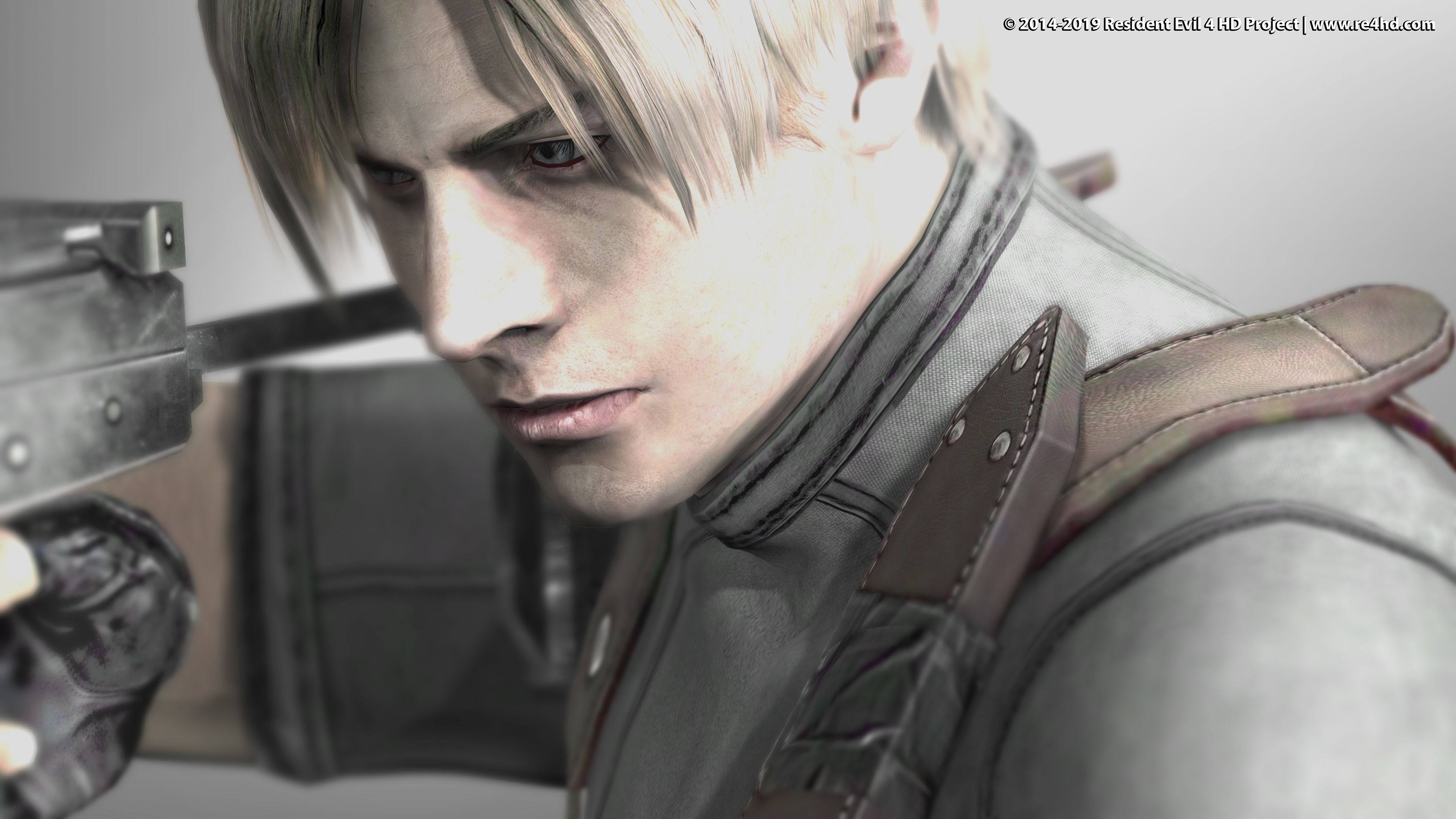
And here’s a present for your patience: You can download a new 4K wallpaper by clicking this image…
I hope you like the edits. Keep in mind even some changes may seem huge they have more sense in motion. You can take a look at the previous posts videos if you haven’t done it already.
Que trabajo más magnífico estas haciendo Albert. Te lo habrán dicho muchas veces, pero quiero decirte que lo que estás haciendo no tiene precio. Nos llenas a todos de alegría por darnos la oportunidad de ver el juego de nuestras infancias en este mejoradísimo estado. Que ganas tengo de jugarlo ya!!
Muchas gracias!! Esperamos poderlo ofrecer tan pronto como sea posible 🙂
realmente se ven tan bien los cambios en especial los de las plagas que por fin puedo verlos a detalle al igual que la de Mendaz, de verdad ya quiero ver los cambios finales en los Zealots y el castillo, muchas gracias por hacer esto posible.
Saludos
Gracias de nuevo 😀
La verdad que son más grotescas de lo que parecen XD
En eso estoy ahora mismo!
Hi.. These changes look absolutely amazing i can’t wait for the final release..i was playing with a trainer for the game (razor’s to be exact) and i swapped characters every thing works fine except if i add krausers bow to the game and hit inventory the game crashes can you guys fix that .. and i know im asking for alot here but just a quick question: of all the guns in the game the Matilda doesn’t have a quick camera turn function so the question is .. is it possible to patch the game so that you can quick turn with the matilda.. Thanks alot guys for all the hard work you have been doing
Thanks!
The inventory crashes because Leon’s inventory doesn’t include Krauser’s weapons. When you swap characters the inventory loaded is still the original character inventory. So, the game don’t find bowgun nor other character exclusive weapon models when you enter the inventory and it crashes.
Some of the other character’s items are not in Leon’s inventory and viceversa. Besides, I removed other unused Leon’s inventory items in order to optimize the file size, otherwise is not possible to improve inventory/merchant weapon, ammo and health 3D models. If Leon inventory file size exceeds 1,3 MB the game crashes.
The only way to add all the other character weapons inside Leon’s inventory file is to make all 3D models lower-poly.
(But I think Raz0r trainer also break the polygons limits, but other trainers surely won’t make that possible)
So, I can create a separate download including Leon’s complete inventory low and high poly versions when the project is complete.
But you’ll have to remind me about that when the moment arrives. There will probably be a “pre-final” release and we’ll wait some time to collect people’s feedback in case there are some bugs, requests (no grain pacth or no flickering plight patch, for example) or something else.
Strange enough, the other character’s inventory (which is just one file for all of them) has no size limits
Oh! I forgot about the Matilda… you know… I had no idea about that! We can’t edit animations, so that’s not possible right now…
Muchas, muchas gracias, Albert. No tengo nada más que decir mas que agradecerte por tu gran trabajo. Saludos desde Chile.
De nada! Como siempre, es un placer ^_^
Looks great, but is there anyway to get leon’s wristband to have the same jagged wrinkly highlight as the original? it suggests the wristband isn’t a smooth cylinder, but crumpled fabric
Actually, looking at it more, are they part of the gloves??
The first two pictures show the ‘wristbands’
In fact, they are part of the arms. And the hands are separate models that change depending of the weapon you are using.
So, I guess this shape is the more natural choice in order to avoid weird animation distortion/clipping issues.
About the specular effect looking more “prominent” in the original is partially because the bumpmap is more detailed now and partially because the specular effect possition in the entire game is slightly changed. It looks better in motion. But I guess I can edit this bumpmap in a way it looks better because we are constantly seeing Leon’s glove.
I’ll give a try 😉
Awesome footage. These screenshots don’t do enough justice to show how much effort you guys put into the remastering process of Chapter 2. Good work, looking forward to the final product.
Thank you again! It’s really hard to do the right choices when we make the screenshots hehe ;-P
congratulations for the wonderful work! Do you intend to make an updated release like the one made in July 2018 before the final release? thanks;)
Thanks! the next update will probably be a “pseudo final” pack. Then we’ll wait some time to get people’s feedback in case there are bugs or any problems and then we’ll release the definitive pack 🙂
SO. EXCITED.
Incredible work. As always. Thank you for what you are doing.
Thank you all for the patience!
tú trabajo es increíble, me ha gustado los cambios en la iluminación, y las sombras, espero pronto echarle guante al juego con tu trabajo instalado, sigo la pagina desde que hicieron el primer pack de la villa, y ha evolucionado, de manera impresionante, de nuevo felicidades y como fan de resident evil, muchas gracias por esta joya, saludos.
Gracias a ti también por tu infinita paciencia! Ha llovido mucho desde ese pack…
Everything is amazing, but one thing I noticed is Ashleys waist seems to catch the lighting in a weird way. Not sure if Im the only one bothered by it. I see theres like a wrinkle in her sweater, but it seems really odd the way light bounces around her. I think the problem is the orange color looks shiny/reflective, almost like it glows.
Its hard to see with so many changes from the brightness around her eyes, to darkness in her cheeks, to brightness on her chest, to darkness on her stomach, to brightness on her waste. Same goes for Leon, but hes not as bad. Maybe you could make the lighting and shadows slightly less drastic/more subtle and smooth on the character models? Or maybe its just the moonlight thats too strong?
https://i.imgur.com/ywcxwRW.jpg
The close-up picture of the note on the bed looks amazing, especially the handwriting, but I think you brightened it up a bit too much. The top right corner of picture 74_B seems a little dull and might look nicer if it was a little darker, like in the original. Not a big deal though 🙂
Aside from Ashleys waste everything looks amazing!
One more thing about Ashley, if you look at picture 20_B it appears as if Ashley is much brighter or more lit up than Leon, its like Leon is in the shade and Ashley is in the moonlight. Seems kind of weird how they dont always match. They also look kind of weird in pic 54_B because it seems darker/foggy yet theres still some light source hitting around their eyes and on their chest.
Maybe its just me, idk.
Thanks for the feedback as always!
I know what you mean. I looks well to my eyes, maybe because I’m used to it. The explanation is simple: most light comes from the sky but the characters doesn’t cast shadows to their own model polygons, so, all polygons that face up will receive that light. The polygons of the sweater wrinkles at her waist height are included. Of course, when she is close to other light sources, this effect disappear and all her model is illuminated.
I can’t wait all of you try it by yourselves. I think it all makes more sense in motion and without the “before” image as a reference 🙂
I thought they are more colourful outside in GC version because of fake lights, I guess not for this then
!!!!!
Marry me, though?
Hahah I’ll think about it XD
Both games still looked very similar to each other. The handful of textures more than the newer version offers just was not enough for anything..they even made louis look more polygonal after.. nust darkened everything and threw some improved textures gere n there
Hi!
It needs to be seen in motion. Luis differences are not because the new textures, but the camera angle and illumination and it constantly changes while he moves 🙂
This is great! The light changes most of the time feels a lot better and even darker.
I would point some changes, but that’s just my personal opinion:
. On picture 30B the light is too white for a red fire. I’m pointing this picture, but sometimes the white light doesn’t match the environment and fire, even though you’re aiming for the GC look.
. Sometimes the light feels too dark on the characters, like in 31B, 54B. It was not real, but maybe the artists were trying to compesate for/simulate indirect light.
. On 55B can that red beam cast redish light on Leon and environment?
Thanks for the comment and feedback!
– On picture 30B the light is too white for a red fire
That’s because of the flashlight 😛
In the original, the flashlight is very dull in this area (I don’t know why, see picture 29) I made it to match with the rest of areas flashlight intensity and Leon’s white flashlight is pointing to the flames in that picture which makes a lot of light is condensed there hehe
– Sometimes the light feels too dark on the characters, like in 31B, 54B. It was not real, but maybe the artists were trying to compesate for/simulate indirect light.
Yes, I’m sure that was the reason and the game being a SD game, too. the light is dymanic now, so when you turn you’ll see character’s face more illuminated. I’d say it’s more realistic and it brings dynamism to the lighting. It’s better in motion. I’ve just answered Sean about this same problem a few minutes ago, there’s a more elaborated answer up here 😉
– On 55B can that red beam cast redish light on Leon and environment?
Oh! good idea! I’ll try something subtle but noticeable 😀
No sé si soy yo, pero creo que hay lluvia adentro de la estructura en la imagen 27_B, en la 27_A no hay lluvia (porque están bajo techo) pero en la 27_B si.
Espero haber sido de ayuda, gran trabajo!
Gracias! bien observado, por suerte no es un fallo. (me había asustado XD)
Es simplemente que el pantallazo en B lo he tomado un poquito más atrás que el pantallazo A, y en ese punto la cámara ya se encuentra fuera del mini establo
Saludos!
The improved textures look great, amazing work!
Here’s my feedback for some improvements:
-The wall on 2 B stand out too much. The colors look too vivid. Too high contrast I guess. The color contrast in the original is just right, more muted.
-The dog’s eyes are oriented differently in the hd version (61 B). And the new texture for the hairs doesn’t look that great. I actually prefer the original texture. The orientation of the hairs in the hd texture should be sticking closer to the original hair pattern, especially on the snout area. The hd textures for the mutant dogs on 18 B are great and really well done, so I don’t know why the remastered good dog doesn’t look at least as good.
-On 68B, Leon’s sideburns look off. It’s like there’s an invisible line where the hair stops. On 68 A, the sideburns look natural. https://imgur.com/oHMsleE
-The leather straps look more angular in the hd version, while in the original, it looks curvy. It’s obvious on pics 13 A B and 43 A B. Very sharp angles that don’t look as good as in the original. https://imgur.com/I7iSEsL
– Regarding the last video, Leon’s hair in the inventory menu could be improved by making the hair parting a little narrower, like this for example: https://imgur.com/LEw88nd
Leon’s hair looks fine in cutscenes (and in-game too, if the same model is being used), but apparently (I may be wrong) his model in the inventory menu is a different one, since the hair parting looks a bit wider.
Thank you for the feedback!
– Wall: that’s because the flashlight settings are different now. It’s not because the texture. As I mentioned somewhere else, lights affect much more brighter colors and the corners of that texture are almost white. So, I’ve darkened the brighters areas of that texture to reduce that effect –> Fixed
– The dog’s eyes differneces are consequence of a remapping work I did to match the 3D model. And the hair differences are consequence of a really hardtime I had remapping the rest of the body XD
It was plenty of seams and badly mapped polygons that weren’t almost noticeable whith the low-res texture. And now that I look it closely I agree it needs some revision.
The Colmillos texture has a different distribution and it was much easier to remap while the “good dog” texture reuses a lot of timeas the same piece of texture for different parts of the body. that’s the reason.
– Sideburn: Fixed. It was a texture seam. I thought that part wasn’t visible.
– Leather straps: Fixed. The bone weights for those vertices needed some edits to avoid some terrible clipping issues with the body. I readjusted 2 vertices weights and that’s it.
– Leon’s head and hair models are exactly the same for the 3 cases: Ingame, inventory and cutscenes. Maybe it’s a visual illusion.. hum not sure…
Oh ok, since it’s the same model being used, it must be a visual illusion or simply a result of that specific angle. Great to hear that you’ve already taken care of most of these small issues. Keep up the good work!
The dynamic lighting and textures look amazing. Keep up the good work and best wishes!
(mi nostalgia)en las ultimas 2 fotos siento que se aleja un poco del original por que las cadenas tienen mucha luminosidad tampoco quiero que quede tan oscuro , la foto vieja tiene como un toque de mas antigua y como que tiene una luz en medio de la foto
Looks amazing, can’t wait to see it in motion! Is the pack totally complete once the next release is out, or are there any chapters left? Thanks for your dedication, it’s truly amazing!
es increible, los cambios en la iluminacion son una pasada y el juego de sombras en el personaje y la rectificacion de ellas sobre los escenarios son alucinantes… me encanta que se vea mas oscuro, y como lei por ahi arriba en la imagen 20B espero que si finalmente vas a ajustar la iluminacion entre ambos modelos la iguales a la de leon en lugar de a la de ashley, porque leon en ese espacio tiene una iluminacion perfecta.
41a 41b & 55a,55b
are my favourites ! just look at the before & after details on that eye scanning gate!! Amazing ! The endless improvements needed for this game has almost been reached after years of passionate educated editing thank you Cris & Albert.
Please update Progress Summary.
Hola! Sé que soy un poco quisquilloso en este sentido pero en la imágen 24 (tanto 24_A como 24_B) la pala parece estar flotando ya que su sombra se proyecta lejos del mango, el cual estaría tocando la pared.
Sé que no es un detalle muy importante pero lo había notado ya en el video que subieron a YouTube y la verdad es que le quita bastante solidez a la habitación a mi parecer.
Fuera de eso es un trabajo impresionante y sé que muchas veces se les escapan detalles. Saludos!
cris albert i was replaying the game and something that bothersme dont know if already fix this, old game there many rooms in particulary in the daytime before village area and during village area that inside this cabins are way to much light coming from nowehere there are some projected light coming from windows but then you have a wall completly iluminated like is outside , is really distracting
can you redo a real interior lighting if is nedded that will respect the lighting physics if there isnt any window you cant have light only by cadle or fire or electrical, turn it more real , there is a room in village area that is together the double door , the one you coming after you encounter first time with mendez and ada, it has lighting inside like as if I didn’t have a roof and all the floor very iluminated, and the roof is almost black this is from the original game o know they did this to make the boxes of lot, visible, but if you fix this interior rooms fake lighting, to real lighting ,even if they have to be in dark the better!..
is too distracting, i hope you can make this changes, to make the game more coherent, now we are in 2019 and no more sd resolution!
examples
https://ibb.co/QjJGXkP
https://ibb.co/sCYzHdM
best regards
there are many more those two are enough example
hi i share with you a link with pictures with some really minor visual bugs i encounter
https://matias-augusto-s.imgbb.com/
https://i.ibb.co/vBZkNzY/el-gigante-skybox-two-pathways.png
https://i.ibb.co/Vv1pWvd/skybox-geometry.png
https://i.ibb.co/0GP4F7Z/Untitled.png
https://i.ibb.co/djzWRh0/2.png
https://i.ibb.co/pX487gW/3.jpg maybe less lighting on interior rooms would be better
https://i.ibb.co/KXPjz5v/there-isnt-any-water-behind-wood-sticks.png
https://i.ibb.co/SvVGqFP/where-is-this-lighting-coming-from-01.jpg
https://i.ibb.co/Y0bHWKq/strap-collision-under.jpg
https://i.ibb.co/bXC3vCT/texture-transition-problem.jpg
in the church while salazar is talking to leon the candle lamp from the ceiling is flickering
when leon looks del lago scene when ganados trhow the body we can se his straps holder from his back incerted inside his geometry of the back
regards
the mud texture from the water of the lago monster is missing in its version at night , looks cristal clean water
Thanks! I’ve received all your pictures and I’ve saved them all in my project’s folder ;D
“in the church while salazar is talking to leon the candle lamp from the ceiling is flickering”
I can’t find the problem. could you take a picture of the moment it happens?
was in 60 frames , mm going to try to revisit that part again and see if the problem still there!
Ok! I don’t see anything at 60 fps either
I skimmed through the video from last month and took some pics of places where the lighting seems off, I did this kind of quickly so if you’d like I can try and be more specific
https://i.imgur.com/I26DByy.png
I really think it would look nicer if you toned down the moonlight and give ashley a very subtle light to reduce the contrast of shadows and ghosting in her face, you keep saying its more realistic with the dynamic lighting but its not pleasing to the eye. I’d rather have visual clarity to see her face properly, without her chest being super bright
maybe is because the ashley model have attach some lighting to her so she stand up to much , maybe turning it off just fix it
Thanks for the feedback. I knew the lighting changes would imply a lot of comments hehe
It’s really hard to properly calibrate the lights. Not because they are hard to edit but because every model has a limit of light sources they can be reached by at the same time. And I only can apply 2-3 “atmospherical” lights to the characters in every room.
This is one of the reasons Capcom used so many times the fixed lights. So by using just a light the characters are bright enough all the time no matter the camera angle you are facing, but this generates an unnatural feeling, specially at HD resolutions.
But I’ve done some changes that I think will please everyone 😉
Hey Albert, when is the next update?
Not sure yet. Maybe I’ll post some quick update before the video, because there are a lot of enemies to restore in this new chapter and I’ve been appliying some edits to the previous chapter accorging to the feedback as I always do.
Stage edits are done, just some enemies textures remain to be done for chapter 3-1
Thanks for the patience! 😉
yous i really like the changes alber and chris are making, sirously they shine a new light on one of my favorite but old games… please, for the love of god dont complain thta i looks diferent or that i is not diferent enough. I have full faith on their dedication and take any changes as a invitation to expirence a better but slightly different game… at least wait for the relase so that we can gat a better look on what is changed… also albert could you reconsider the moded flashlight as a viable option going forward in the future? i find the olther flash light more appealing, maybe we can combine them both…. working as a light source for object and as the old flishlight for models….i don’t know… i am not good at modding.. anyways thanks for the timea dn effort. This project keep looking better each update
about the lighting on the characters,
is very simply to fix, and Albert knows deeply
Albert just have to make the characters receive the same amount of lighting in the same place they can be,
but some rules on this old game can be broken ,a modern game like evil within and many other modern games,can have the main character in complete dark because it uses modern lighting and works fine , but in this game you cant do that, with all this baked lighting and shadows over the place, would be nice if albert would rebake all the lighting and shadows of every corner in the whole game,…with this old lighting system he must be careful to watch that lighting do not make the model look overexposed (broken exposition ghost face) crashing whites or very black.
its obvious capcom did cheap tricks to the game of that time, like Albert said ,he keeps finding secrets of development , and is very fun to watch and participate.
about the flashlight the first custom change he did about the position the light, from the flashlight, aligned with the leons waist it looked fun and better to me. real world rules are better for immersion, but i know maybe is hard to see in some places on this particular game even so , this game never reach a pitch black ambient. he can make a vote about that and see what version people want.
I like the idea of patches, the more options for players the better ! The lighting in this game always was ridiculous but I haven’t even seen all the new changes to the full game, After a full release of this mod it will be better to judge how things are. I remember there was a filter being shown in the last video..?..& I really hope the dark filter will be an option with the next release as it looked fantastic to me.
Hi, There’s a problem in the Mercenaries, When you choose 60FPS, there are a few enemies, But in 30FPS there are alot more, and they appear quickly when you turn back unlike 60FPS, Can you fix it so that the enemies numbers are the same
I hope you understand what i mean
Hi!
Is this a problem that was already there without modding the game?
Do you have the 1.0.6 version of the game?
We can’t fix 60fps related issues. This is one of the reasons I always suggest to play this game at 30fps. It was designed this way and the porting team did a bad job during the conversion to 60fps. So, I simply ignore the 60fps mode exist…
Luis looks better with moustache
https://www.re4hd.com/wp-content/gallery2/0153-chapter2/CHAPTER2_31_A.jpg
https://www.re4hd.com/wp-content/gallery2/0153-chapter2/CHAPTER2_31_B.jpg
I know that this would be very hard, but is there any chance that cutscenes in which Leon uses a weapon get reshot and made so that depending on which weapon he posseses, he uses said weapon in the cutscene. For instance, the Chief mendez boss battle: If the Punisher was in the inventory, it would be in the cutscene as well. As well as the whole body armour not being in the cutscenes
Also, is there a way for me to mod the game so that those cutscenes waste 1 pistol bullet
I’m sorry that’s impossible… The cutscenes use just the models stored in the cutscene files and there’s only the first handgun model and there’s no way to make is changes the model depending on what the player is using.
In other words, the only thing the game takes into consideration while rendering the cutscenes is which custom the player uses. Other that that, everuthing else is completely fixed.
Great work man. It looks really nice. I think the only two criticisms I have here are the shot with the girl and the candle where the room is very warm in the original, and the candle doesn’t give off much warmth in the HD shot making it very cold. It makes her face a bit odd looking in the dark, but that just might be how it is with all the upgrades to lighting.
My second thing was the vampire wolf. I think maybe a little more work on blending that wolf fur might help IDK. Not really anything huge though. I can only see screens. Maybe darken the wolf a tiny bit? Really great stuff man keep it up.
Thanks!
About the picture of Ashley and the candles behind her. I already answer about it a few times. But I understand the concern because the difference is huge.
Oh the cutscene has the same colors in our version compared to the GC/Wii game running on Dolphin.
The original PC colours are WRONG. It looks warmer and sometimes a loooot warmer, brighter and overexposed because a filter was broken during the porting process and it changed the colours of the game. Some areas have slightly yellowish colours, or reddish, and with different intensities. Some other areas have no problems. So, it’s not a general issue of the game, it depends on the area.
This is how it looks in the gamecube (i don’t know the capture method used in this video, but it’s a good approximation:
https://youtu.be/t6sKj1aFF7c?t=2843
and here’s an animated gif using a screenshot I’ve taken riht now (sorry for the cursor XD)
https://www.re4hd.com/wp-content/uploads/2019/08/AHSLEYCOLOUR.gif
About the dogs, I agree the good dog need some more work, no problem! 😉
in the nicely done GIF you did ,
i can see two minor differences between versions
i am sure you already adjusted this differences XD
the line corner of the Ashley eyes, little below her eyebrows, is way to dark,
and the line from the eyes where her eyelashes are is dark too,
compared too PC original and game cube Wii versions.
also this happen on some others texture from Leon trousers and the ears details
this happen because when we try to retouch textures ( i worked with photoshop) grey tones turn way too dark , all expressions lines try carefully to blend them in with mid tones never apply dark or pure black
many times many layers gone superimposed, so some effects get multiply and turn contrast way to much.
the other thing i see is the specular shine on the iris of the eye,
i think the original ads more depth to the expressions of her face,
saying this i don’t mean by this that that version is better , it just causes different subtle expression on the eye , idk witch the way to make the eye shine correctly or realistic but is really a minor thing
incredibly work as always
Yeah the other more normal wolf further down looks odder too. That one I think could definitely use some work on the fur if possible. It just looks a bit scattered with the textures, but this may be a limitation of the bad model. But it’s so minor most would not care. Again, great job man it looks absolutely mind blowing compared to the original shite.
Dear Albert, i saw a gamecube version of Resident Evil 4 and in this version the take items menu (when a enemy is dead and we take items from its body) is transparent and very good that way. In PC version the take items menu is dark and not tansparent. I think making a transparent taking item menu will be very good and much better way from dark-not transparent menu. Please make taking item menu is transparent like gamecube version.
Hello! that’s not possible. Whatever it makes that screen transparent or black is “hardcoded” in the exe file.
What you see in the Gamecube version is a pixelated/blurred screenshot of the scene.
All the effects that used a blurred low-res version of the rendered frames (which I suspect they were generated by the GC hardware somehow) were lost during the HD porting process when the game was ported to PS3/X360
And this PC port is based on the X360 port.
These effects are:
-Depth of Field during cutscenes
-Intense fire effect (a faint blurry effect around almost all fire effects)
-Blurred water (in the lake, in the Merchant caves…)
-Blurred skies (a variation of the Depht of field, but used ingame)
-Pick item semitransparent background images
-When the image gets frozen during the last cutscene, before Ashley asks Leon about having a date
Hey Albert (and Cris, if you’re reading this)! I know I haven’t given any suggestions in a while, probably over a year, and I must say the project looks spectacular.
The ONLY finishing touch you may want to consider is making the eyeballs of https://www.re4hd.com/wp-content/gallery2/0153-chapter2/CHAPTER2_14_B.jpg either hazel to green or dark blue. The reason why is because capcom made most of the people in the village have light eyes, so seeing the dark brown eyes is a little jarring. Maybe even make the eyeballs bright glowing orange, like how the peoples eyes look when super-possessed/activated. Again, I bring this up because almost no one has brown eyes in the entire game. This tiny edit would add leaps and bounds into the immersion factor, because one thing you notice strongly whenever the heads transform are the eyes. You’ve guys worked on it so long you might as well add that little detail.
Just a suggestion.
Hello!
Good observation! I’m not sure if we should change the color because the original head, including the eyes, exploded and nothing remained. What I mean is the original eyes are gone, too. So, the Plaga eyes are not necessarily the same color than the host eyes.
Maybe making them slightly reddish would work, unfortunately I can’t make them to glow…
Thanks!
What’s up Albert. Great observation. It appears the original head does explode, and a new head emerges with a new set of eyes. Maybe you should add an obviously inhuman aspect to it, so it doesn’t look so “normal.” The idea of a mutant alien-like creature hosting the body of a human having two regular, somewhat yellow (sclera), brown eyes is a little flat/uncreative.
He’s another screenshot of the new-head https://vignette.wikia.nocookie.net/residentevil/images/4/40/Resident_Evil_4_-_Las_Plagas_1.jpg
Maybe make the iris a kind of grey-brown and make the sclera more veiny/bloodshot (https://www.google.com/search?q=bloodshot+eyes&source=lnms&tbm=isch&sa=X&ved=0ahUKEwj-u665uqDkAhUrSN8KHYtDD9AQ_AUIESgB&biw=2133&bih=1041)
Anyways, the only reason I bring it up is because in the game whenever the heads burst, I would ALWAYS immediately notice the eyes.
Side note: I googled “re4 queen plaga” and this picture came up from an anime as a top 20 result https://vignette.wikia.nocookie.net/aliens/images/b/bb/Parasyte-the-maxim-5.jpg/
It seems RE may have had some inspiration from this 80’s-90’s anime. https://www.google.com/search?q=Kiseijuu:+Sei+no+Kakuritsu&source=lnms&tbm=isch&sa=X&ved=0ahUKEwir0-zpwKDkAhXvs1kKHdZRBqcQ_AUIESgB&biw=2133&bih=1041
Hehe yes, the villagers plaga looks really similar to this anime creature. I’m sure they use it as reference!
I’ll see what can I do with those eyes so they look more beatiful 😛
Hey guys 🙂 Im sorry to bother you with little things, you probably wont think these are important but I just wanted to point them out.
Ashleys eyes could be a little prettier (like specifically the coloring around her pupils) in pic 65_B they look kinda muddy, while in 65_A they’re more hazel, I dont know maybe its not a big deal but I think you have done a better job with other characters eyes and ashleys shouldnt be too dull
I know weve talked about the color and your choice to use more white and less yellow (which is fine for the most part) but theres a few little things that kinda stand out to me. Salazar is very grey/pale in the face which would be fine if hes outside, but I believe the picture of 65_B is taken inside near flames? not sure
And my biggest issue is the wood fencing and structures around El Gigante in pic 59_B is way too grey IMO, i wish it was slightly more brown so that it wouldnt clash with all the surrounding grey surface areas (including gigante himself) same with pic 49_A the wood looks better with a little color
Anyway, I understand if you dont plan on redoing too much of the village, but just wanted to point out a few small things for you to consider 🙂
What should be done when the company says it will release the remastered version, is often just the passing of an image filter to make it smoother, if anyone sees the FF8, it’s one, which, without words …